Understanding Human Exposure to Heat
Overview
In this bite-size lesson, you will use Google Earth Engine to look at data from Daymet Daily Surface Weather and Climatological Summaries, Social Vulnerability Index Grids, and US Grids to learn how to import, clean, visualize, and analyze temperature and social vulnerability data.
Learning Objectives
After completing this lesson, you should be able to:
Search for and import data into the Google Earth Engine Code Editor
Subset data in Google Earth Engine
Understand how to use cloud assets
Visualize the relationship between temperature change and social vulnerability using scatter plots
Introduction
What is Climate Change?
Climate change refers to long-term shifts in weather patterns and characteristics, including changes in temperature and precipitation (such as rain and snow) and an increase in extreme weather events like hurricanes, wildfires, and sea-level rise (Romm 2022). The primary cause of climate change is human activity, particularly the burning of fossil fuels like coal, oil, and gas, which release greenhouse gasses into the atmosphere.
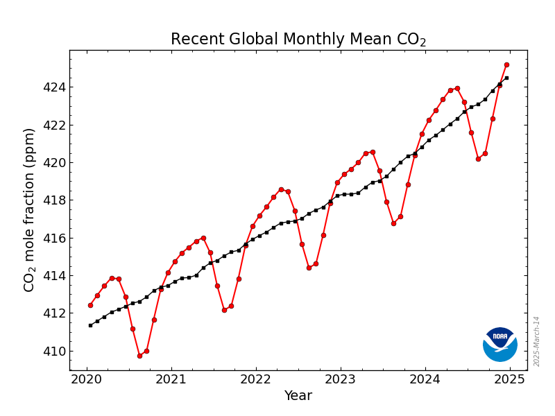
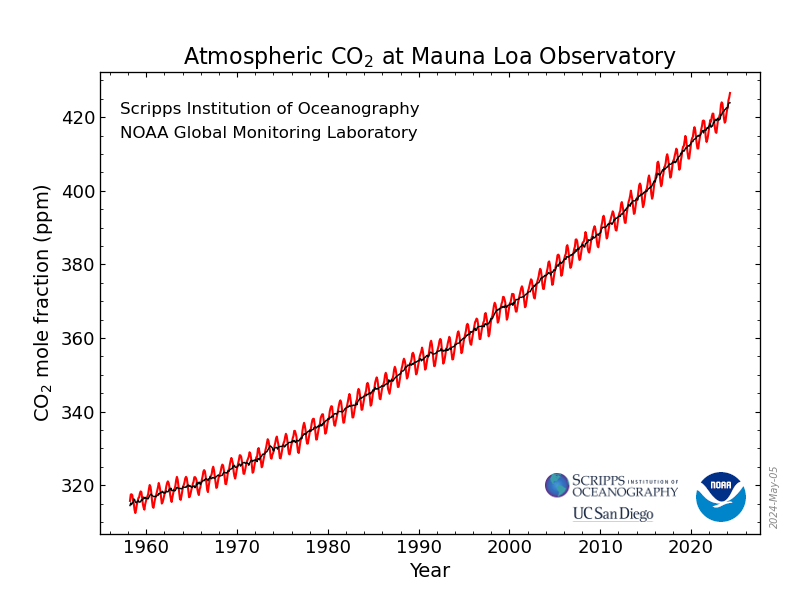
The graph above demonstrates the monthly average of carbon dioxide, a driving greenhouse gas in climate change, measured in the last five years at Mauna Loa Observatory. Although the oscillations above can be explained by seasonal variation, there is a steady increase in carbon dioxide concentrations over these five years. Below is a graph demonstrating average carbon dioxide levels over the last 60 years, where increases of over 100 parts per million have been recorded.
Other greenhouse gas contributors include methane, nitrous oxides, and fluorinated gasses (Kuok Ho 2022). These gasses are largely generated by industries such as transportation, construction, agriculture, and land-use conversion. For instance, transportation is responsible for 19.2% of global carbon emissions and is expected to double by 2050, significantly raising global temperatures (Abraham et al. 2012). Similarly, agriculture contributes to greenhouse gas emissions through fertilizer and pesticide production, machinery use, diesel consumption, and emissions from crop irrigation (Yin et al. 2024). These emissions pose numerous threats, potentially leading to food insecurity, water scarcity, catastrophic storms, rising sea levels, flooding, melting polar ice, and declining biodiversity.
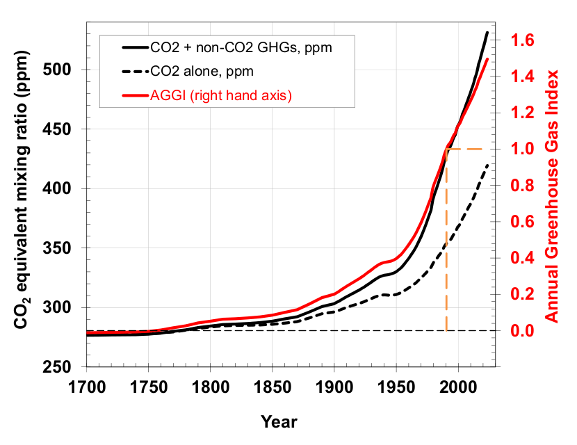
The figure above shows the release and increase of Greenhouse Gas Emissions dating back to the 1700s. Earth’s current temperature is the warmest it has been in the last 100,000 years, with an average increase of 1.2 degrees Celsius compared to the late 1800s (Nations n.d.). Addressing the primary drivers of climate change, such as transportation emissions, offers promising solutions. Public transportation, electric vehicles, and non-motorized transport could significantly reduce these emissions (Jochem, Rothengatter, and Schade 2016). Public support for climate action is also growing. A 2018 study by the University of Chicago revealed that two-thirds of Americans would back a carbon tax if the proceeds were directed toward environmental restoration (Oreskes 2024). Government action has mirrored this shift in public sentiment. In 2022, President Biden signed the Inflation Reduction Act, marking the largest investment in the economy, energy security, and climate initiatives in U.S. history (Rajagopalan and Landrigan 2023).
Heat and Human Health
Rising global temperatures will also have negative effects on human health. The National Oceanic and Atmospheric Administration (NOAA) has generated the classifications below on the effects of heat on the human body (Service 2024).
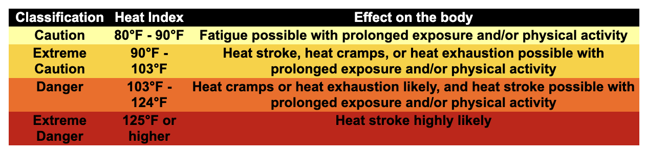
Prolonged exposure and activity in the heat can lead to dangerous heat disorders for humans, and disproportionately impacts vulnerable populations, including children, adults over 65 years old, adults with underlying health conditions, pregnant women, and outdoor workers. The CDC found that in 2023, the warm-season of May through September saw peak heat-related illness emergency visits (Disease Control and (CDC) 2024). As climate change causes longer, hotter, and more frequent extreme heat around the world, we can expect to see more heat-related illnesses.
Setting up your Google Earth Engine Account
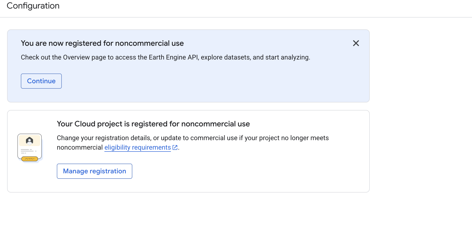
Google Earth Engine is free for non-commercial use. In order to access and run the code we will be working with below in the code editor, you must create an account. Upon launching the project (click here), you will be prompted with the following message:
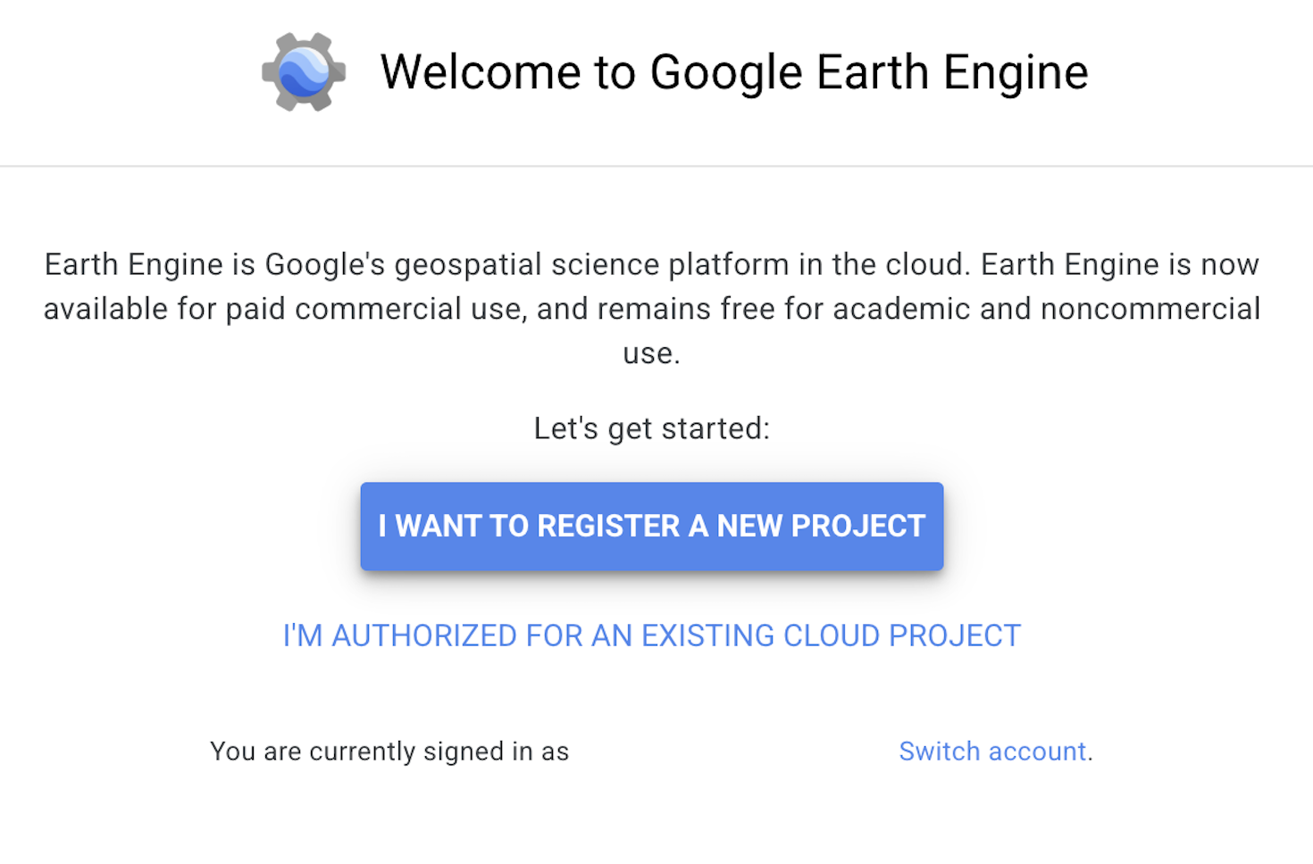
Select “I want to register a project”, which will lead you to a welcome page. Here, navigate to the configuration section on the left side.
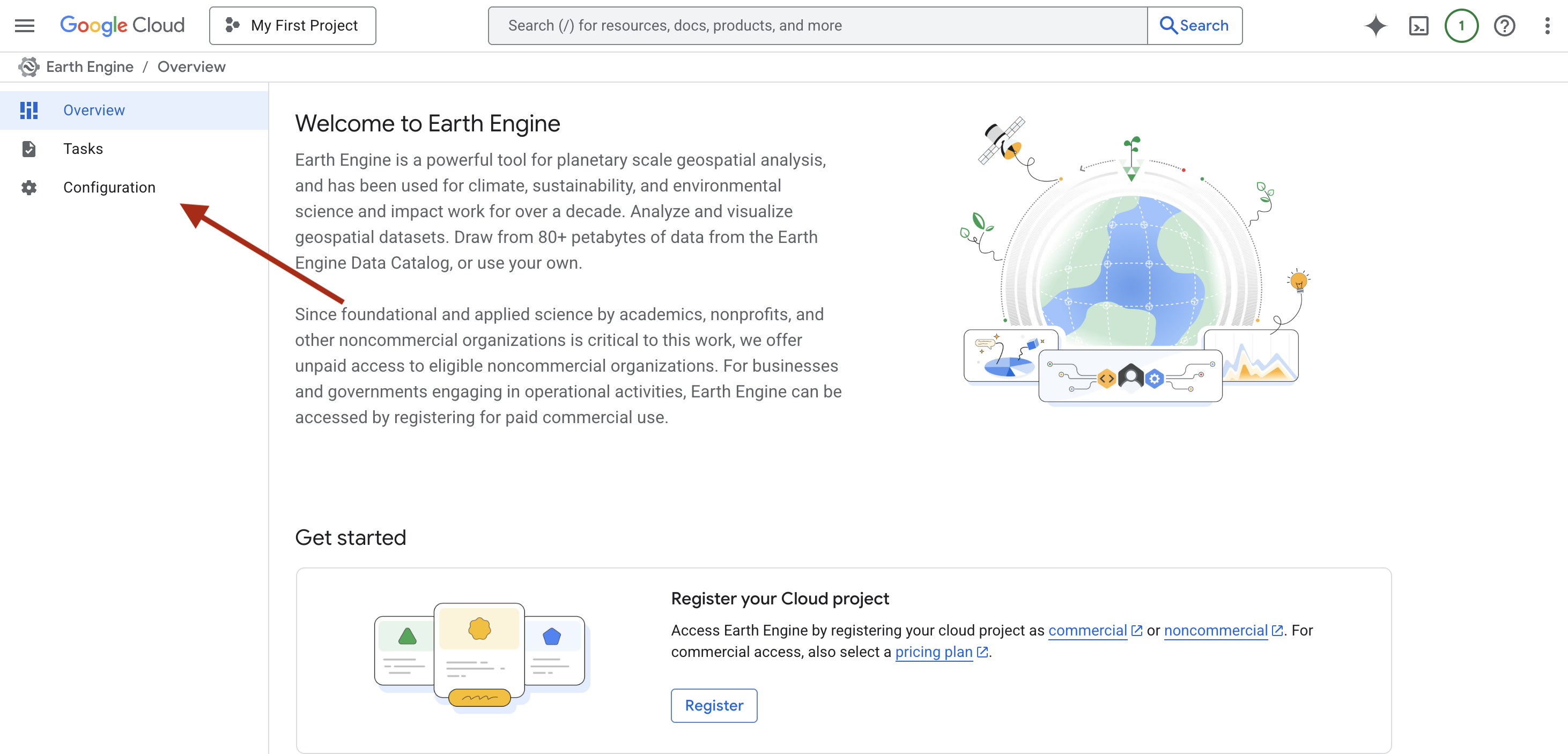
In the configuration section, you will be asked to register for commercial use or check if you are eligible for non-commercial use. Get started with registering for a non-commercial account.
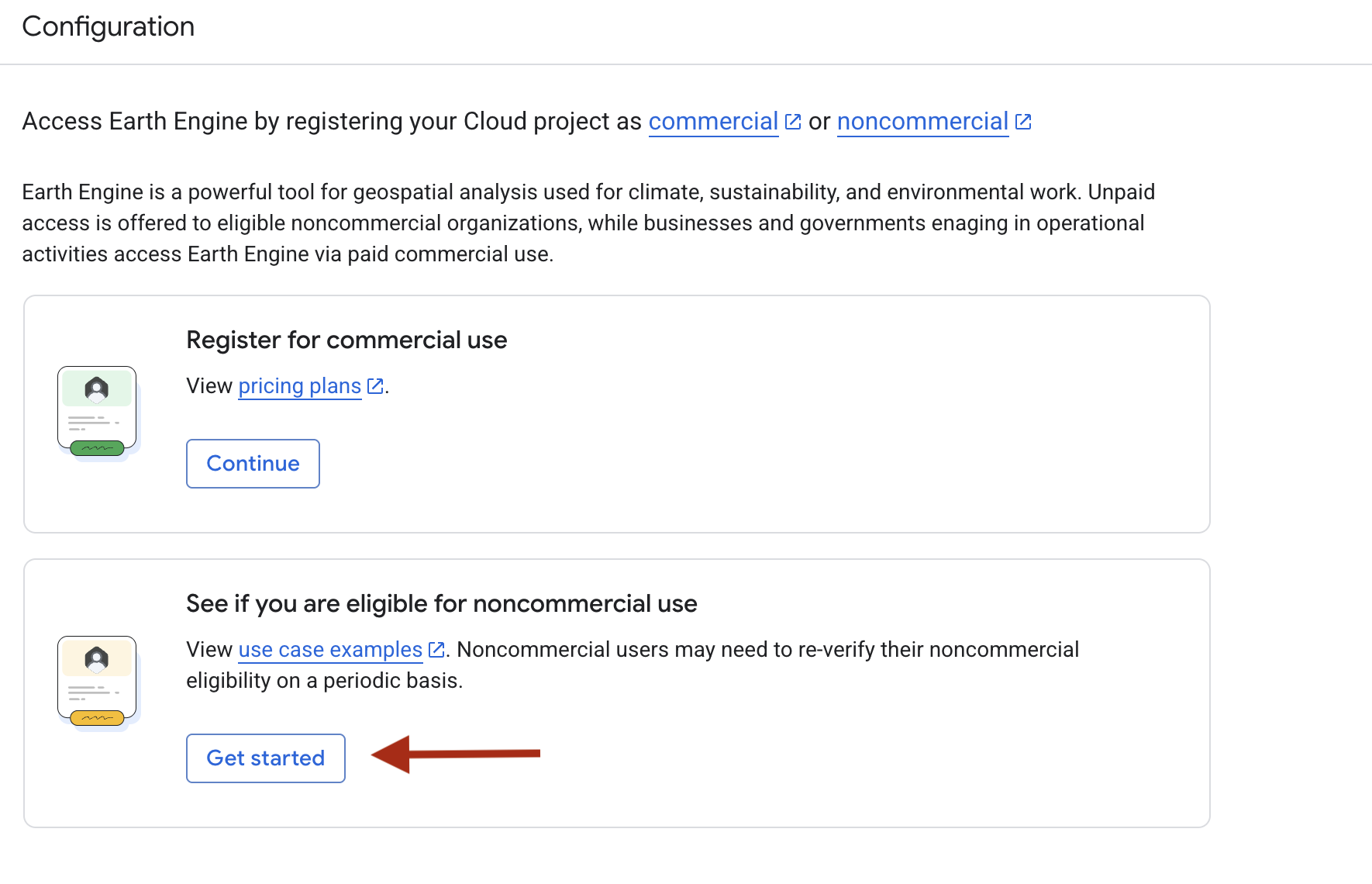
You will be asked to fill out a series of questions. Register as an independent user or how you see fit for your own Google Earth Engine use.
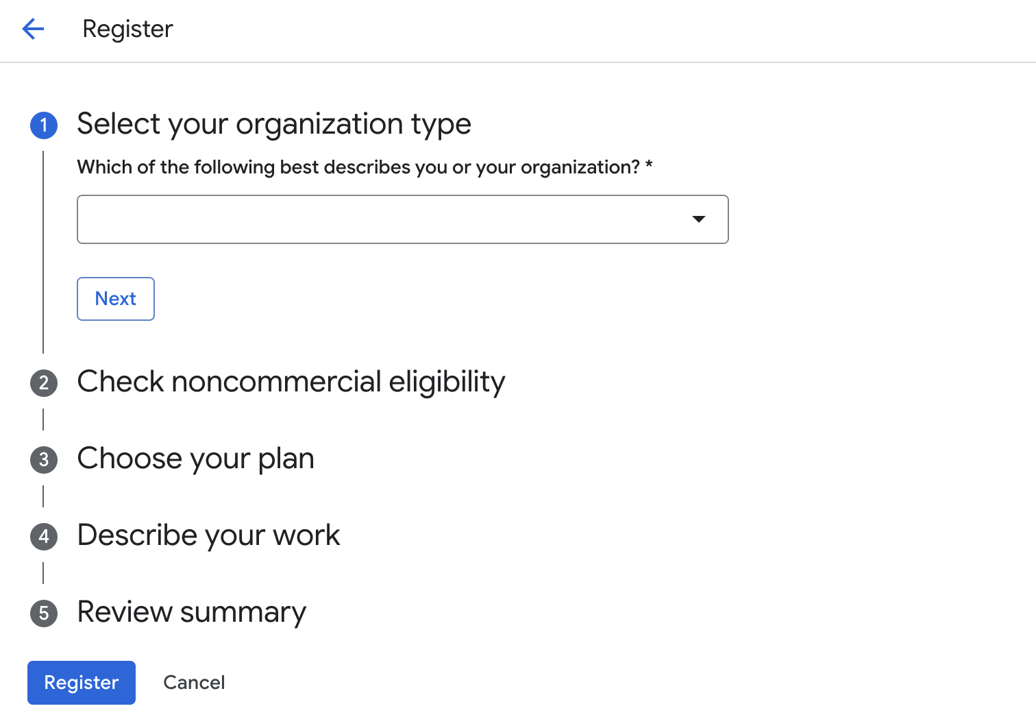
After submitting, you should find a message that you have been registered for non-commercial use. You will be able to open the project now.
Exploring the Data
Daymet V4: Daily Surface Weather and Climatological Summaries
Daymet V4 provides gridded estimates of daily weather parameters for Continental North America, Hawaii, and Puerto Rico. It is derived from selected meteorological station data and various supporting data sources. Daymet is provided by NASA ORNL (Oak Ridge National Laboratory) DAAC (Distributed Active Archive Center). The data is available starting in 1980 through 2023 with daily coverage. Each pixel size is 1000 meters (1 kilometer). Daymet provides a number of variables, including total precipitation, daily maximum and minimum 2-meter air temperature, and several other meteorological factors. You can find a full list of the variables on the Earth Engine Data Catalog entry for Daymet V4.
Because the analysis we will be doing today will focus on Arizona state, we will be using Daymet V4. However, there are several datasets with global spatial resolution for those who are interested in visualizing and analyzing temperature change in other parts of the world. Try utilizing the Earth Engine Data Catalog search engine for data you are interested in.
TIGER: US Census States 2018
The United States Census Bureau TIGER dataset contains the 2018 boundaries for the primary governmental divisions of the United States. In addition to the fifty states, the Census Bureau treats the District of Columbia, Puerto Rico, and each of the island areas (American Samoa, the Commonwealth of the Northern Mariana Islands, Guam, and the U.S. Virgin Islands) as the statistical equivalents of States for the purpose of data presentation. Each feature represents a state or state equivalent. Our analysis will focus on Arizona state, but we will learn how to select any state from the TIGER boundaries. This means that once our lesson is complete, you will be able to do the same analysis on the state of your choosing. Try the same analysis on a neighboring state or a different region of the US.
U.S. Census GRIDS
U.S. Census Grids, Demographic and Housing Characteristics File, 2020 contain grids of demographic and socioeconomic data from the 2020 U.S. Census. The data are available for download in GeoTIFF, and Shapefile formats. The grids have a resolution of 15 arc-seconds (0.00415 decimal degrees), or approximately 500 square meters at the equator. The gridded data are derived from census block geography from Census 2020 APIs, and variables on population, households, and housing from Census 2020 Demographic and Housing Characteristics File (DHC). This data set is produced by the Columbia University Center for International Earth Science Information Network (CIESIN) using data provided by the U.S. Census Bureau.
The gridded variables are based on census block geography from Census 2020 Demographic and Housing Characteristics File acquired through the U.S. Census APIs, and variables on population, households, and housing from Census 2020 Demographic and Housing Characteristics File (DHC).
Working with the Data
For this lesson, we will import each dataset and clean the data before importing the next one.
//Note: In Google Earth Engine, we can use ‘//’ to write notes without having it impact our code. The Code Editor will ignore whatever is written after ‘//’
//Import Daymet dataset for 2023: Daily Surface Weather and Climatological Summaries
var daymet_2023 = ee.ImageCollection('NASA/ORNL/DAYMET_V4') //Let’s name the variable 'daymet_2023' to keep track of the dataset we are using
.filter(ee.Filter.date('2023-07-01', '2023-07-30')); //The ee.Filter.date function will help us identify the time series we'd like to use. Once you are comfortable with filtering the date, feel free to change this to what you are interested in looking at.
var maximumTemperature_2023 = daymet_2023.select('tmax'); //By selecting ‘tmax’, we are selecting the maximum temperature for the time series we selected
//Import the same dataset in 1980 to compare the temperatures
var daymet_1980 = ee.ImageCollection('NASA/ORNL/DAYMET_V4') //Let’s name this variable 'daymet_1980'
.filter(ee.Filter.date('1980-07-01', '1980-07-30')); //Identify the time series we'd like to use again
var maximumTemperature_1980 = daymet_1980.select('tmax');
//Next, calculate the average maximum temperature for the first time series we selected (2023)
var averageMaximumTemperature_2023 = maximumTemperature_2023.mean();
//Do the same for 1980
var averageMaximumTemperature_1980 = maximumTemperature_1980.mean();
//Create a color palette variable for temperature on a celsius scale using a 0-30 degree range
var maximumTemperatureVis = {
min: 0.0, //The ‘min’ and ‘max’ will refer to the minimum and maximum values on our scale
max: 30.0,
palette: ['1621A2', 'white', 'cyan', 'green', 'yellow', 'orange', 'red'], //Select an intuitive color scheme for visualizing temperature
};Great! Now that we have visualizations of temperature in 1980 and 2023, let’s import our state boundaries for Arizona. We will clip the average maximum temperature for both our points in time to visualize just Arizona.
//Load Arizona's boundary from TIGER
var arizona = ee.FeatureCollection('TIGER/2018/States')
.filter(ee.Filter.eq('NAME', 'Arizona')); //Google Earth Engine will recognize the states by their name; feel free to experiment with loading in additional states to see how it works
//Clip the average maximum temperature to Arizona in 2023
var clippedAverageTemperature_2023 = averageMaximumTemperature_2023.clip(arizona);
//Do the same for 1980
var clippedAverageTemperature_1980 = averageMaximumTemperature_1980.clip(arizona);
//Visualize the clipped average temperature
Map.setCenter(-99.21, 31.8, 4); //The ‘Map.setCenter’ is a function that will set the initial center and zoom level on the map based on coordinates
Map.addLayer(clippedAverageTemperature_2023, maximumTemperatureVis, 'Average Maximum Temperature (2023)');
Map.addLayer(clippedAverageTemperature_1980, maximumTemperatureVis, 'Average Maximum Temperature (1980)');Great! We’ve subset and cleaned the data so far. Next, we will calculate the temperature difference between 1980 and 2023 to see how it has changed in Arizona.
var temperatureDifference = clippedAverageTemperature_2023.subtract(clippedAverageTemperature_1980);
//Using ‘subtract’ will subtract the pixel values of two images.
//Define visualization parameters for the temperature difference. By creating a variable for this, we can reference it when adding a map layer
var tempDiffVis = {
min: -5.0,
max: 5.0,
palette: ['blue', 'white', 'red'] //Blue = cooling, white = no change, red = warming
};
//Visualize the temperature difference by adding the layer to the map
Map.addLayer(temperatureDifference, tempDiffVis, 'Temperature Difference Between 1980 and 2023');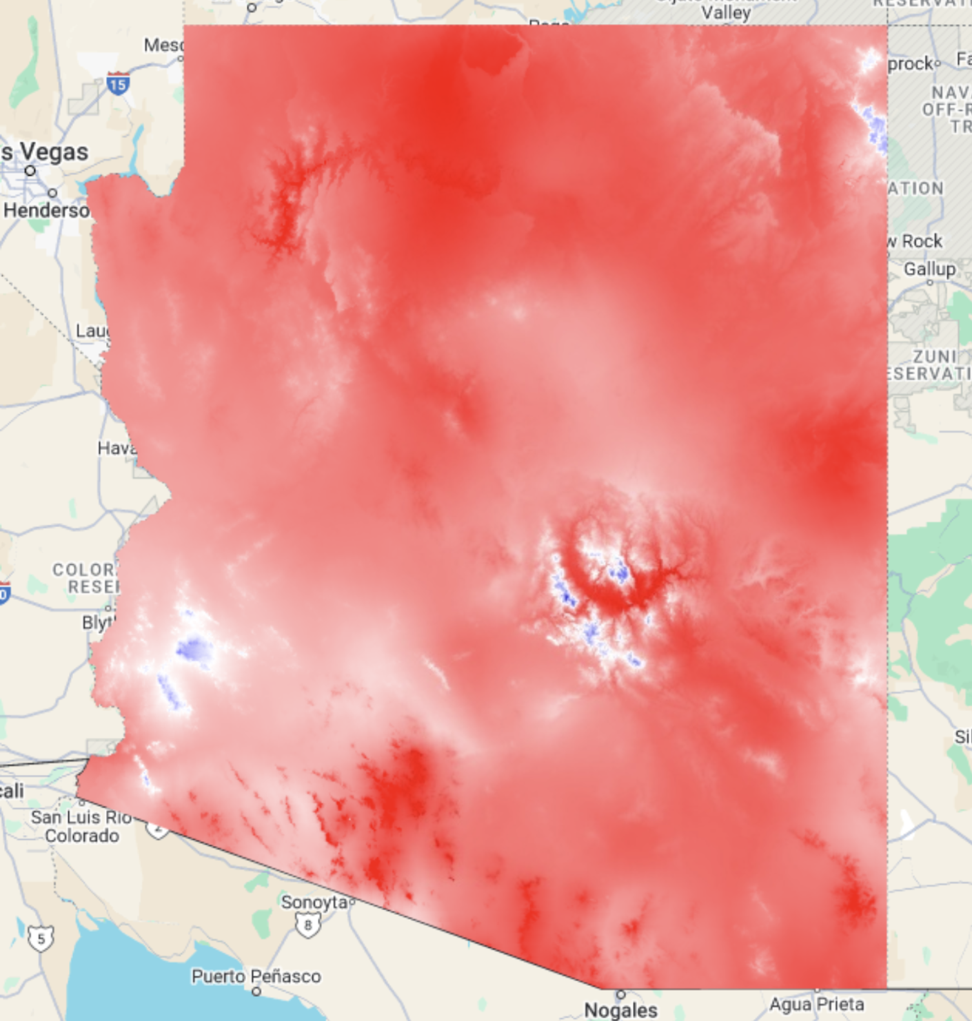
Now we have the temperature change in Arizona between 1980 and 2025! Use the inspector tool to see how different regions have warmed or cooled. By how many degrees has warming occurred in areas that are red on the map? By how many degrees has cooling occurred in areas that are blue on the map?
Let’s move onto the next part of our analysis and visualize social vulnerability and heat vulnerable ages in Arizona. For this, we will use cloud assets. This allows us to upload our own data into Google Earth Engine. Cloud Assets are stored in Google Cloud Products and can include images, image collections, tables, and folders for analysis in Google Earth Engine. You can read more here.
For this analysis, we will need to access three Cloud Assets:
By clicking here, you will access the SVI Cloud Asset. By clicking here, you will access the 65 to 79 age group Cloud Asset. By clicking here, you will access the over 80 age group Cloud Asset. Add these to your project and rename the variables ‘svi_overall’, ‘az65_79’, and ‘az_80ov’, respectively. You can do this in the import bar on the top of the Code Editor.
//Import SVI overall
var svi_overall = ee.Image(svi_overall);
//Define visualization parameters
var svi_palette = {
min: 0,
max: 1,
palette: ['440154', '3b528b', '21918c', '5ec962', 'fde725'] //This is a more traditional SVI palette, but feel free to change the colors to what is most intuitive for you
};
//Clip to arizona
var sviArizona = svi_overall.clip(arizona);
//Add the SVI layer to the map using the palette we created
Map.addLayer(sviArizona, svi_palette, 'SVI');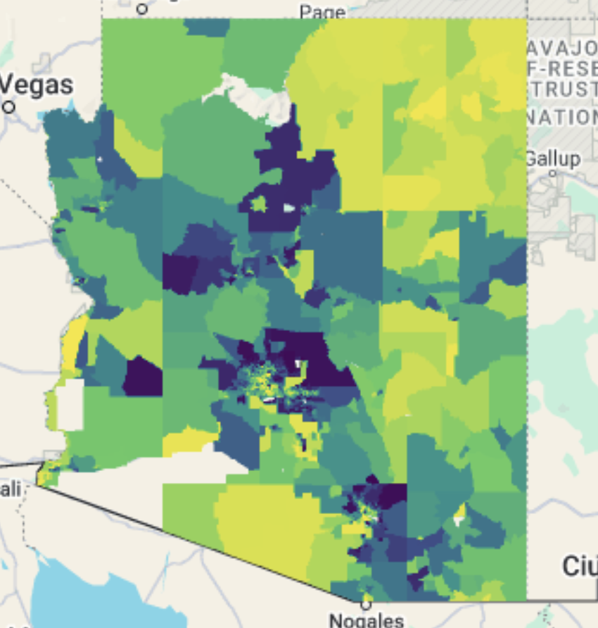
We can now visualize SVI on the map over Arizona! Next, we’ll generate a chart to display average temperature change by SVI.
//Group SVI into 5 categories
var sviQuintiles = sviArizona.expression(
"(b1 < 0.2) ? 0" + // SVI < 0.2
": (b1 <= 0.2) ? 0.2" + // 0.2 <= SVI <= 0.4
": (b1 <= 0.4) ? 0.4" + // 0.4 <= SVI <= 0.6
": (b1 <= 0.6) ? 0.6" + // 0.6 <= SVI <= 0.8
": (b1 <= 0.8) ? 0.8" + // 0.8 <= SVI <= 1
": 1", { // SVI > 0.8
'b1': sviArizona
}
).rename('SVI_Quintile');
//Compute the mean temperature change for each SVI quintile
var stats = temperatureDifference.addBands(sviQuintiles)
.reduceRegion({ //Reduce region allows us to summarize values in a geographic region; in this case, we will use mean
reducer: ee.Reducer.mean().group({
groupField: 1,
groupName: 'SVI_Quintile'
}),
geometry: arizona,
scale: 500,
maxPixels: 1e13
});
//Extract the 'groups' list: this will extract a list of grouped statistics from the reduceRegion function
var groups = ee.List(stats.get('groups'));
//Convert groups into proper dictionaries and extract SVI and average temperature change
//This converts grouped statistics into two lists (one for SVI and one for average temperature change)
var sviValues = groups.map(function(item) {
return ee.Dictionary(item).get('SVI_Quintile');
});
var tempChanges = groups.map(function(item) {
return ee.Dictionary(item).get('mean');
});
//Create the chart using ui.Chart.array.values(); we will make stylistic choices here as well
var SVIchart = ui.Chart.array.values({
array: tempChanges,
axis: 0,
xLabels: sviValues
})
.setChartType('LineChart')
.setOptions({
title: 'Average Temperature Change by SVI',
hAxis: {
title: 'Social Vulnerability Index (0 = Lowest, 1 = Highest)',
viewWindow: {min: 0, max: 1}, // Ensure the scale is from 0 to 1
ticks: [0, 0.2, 0.4, 0.6, 0.8, 1] // Define tick marks for clarity
},
vAxis: {title: 'Average Temperature Change (°C)'},
lineWidth: 3,
pointSize: 5,
colors: ['red']
});
//Display the chart
print(SVIchart);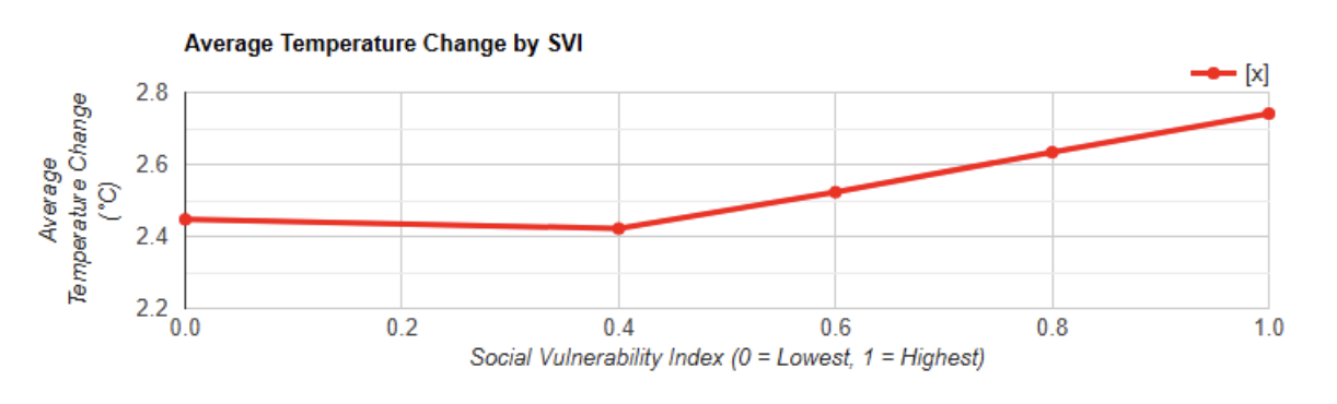
We now have a visual chart showing how temperature has changed based on social vulnerability groups. What can you notice about more and less vulnerable populations and temperature change?
Now that we have visualized social vulnerability in Arizona, let’s use US GRIDS to look at a specific population vulnerable to heat: those over 65. To do this, we’ll use US GRIDS 65-79 and over 80 years old age groups.
//Create a 65+ age group. For this, we’ll use the .add function
var az_65plus = az65_79.add(az_80ov); //Note: you cannot create variables in GEE that start with numbers. For this reason, we are naming the variable az_65plus rather than 65plus_az
//Define temperature change bins
var tempBins = [-1, 0, 1, 2, 3, 4]; //Bins are used to group data into intervals; in this case, we are grouping temperature change into bins for our analysis
//Classify temperature difference into bins
var tempClasses = temperatureDifference.expression(
"(b1 < 0) ? -1" + // Less than 0°C
": (b1 < 1) ? 0" + // 0 to 1°C
": (b1 < 2) ? 1" + // 1 to 2°C
": (b1 < 3) ? 2" + // 2 to 3°C
": (b1 < 4) ? 3" + // 3 to 4°C
": 4", // Above 4°C
{'b1': temperatureDifference}
).rename('TempBin');
//Sum the 65+ population within each temperature bin to find the total in each group
var popExposure = az_65plus.addBands(tempClasses)
.reduceRegion({
reducer: ee.Reducer.sum().group({
groupField: 1,
groupName: 'TempBin'
}),
geometry: arizona,
scale: 500,
maxPixels: 1e13
});
//Extract the groups list
var groups = ee.List(popExposure.get('groups'));
//Extract temperature bins and population sums
var tempLabels = groups.map(function(item) {
return ee.Dictionary(item).get('TempBin');
});
var popValues = groups.map(function(item) {
return ee.Dictionary(item).get('sum');
});
//Create a histogram of exposure
var exposureChart = ui.Chart.array.values({
array: popValues,
axis: 0,
xLabels: tempLabels
})
.setChartType('ColumnChart')
.setOptions({
title: '65+ Population Exposure to Temperature Change',
hAxis: {
title: 'Temperature Change (°C)',
viewWindow: {
min: -1, // Set the minimum value for the x-axis to -1
max: 4 // Set the maximum value for the x-axis to 4
}
},
vAxis: {title: '65+ Population Count'},
legend: {position: 'none'},
colors: ['#ff5733']
});
//Print the chart
print(exposureChart);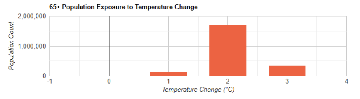
We’ve now created a graph that shows us the count of how many individuals over the age of 65 are in areas that are experiencing temperature change in Arizona. How might this change as climate change continues?
Congratulations! We were able to download, import, and explore Daymet, TIGER, SVI, and US GRIDS data to see how the state of Arizona has been impacted by temperature change and how vulnerable populations have been affected. Try the lesson again and look at different states for temperature change and SVI. You should now be able to:
Import data into the Google Earth Engine Code Editor
Subset data in the Code Editor and create bins of data
Use cloud assets
Visualize the relationship between temperature change and social vulnerability using scatter plots