from IPython.display import display, Image
from IPython.display import HTML
from IPython.display import display ,Markdown
import matplotlib.pyplot as plt
import pandas as pdCommunity-Generated Lesson: The Major Effects of Climate Change Towards the Arctic Ecosystem
We will be focusing on is data analysis (management and analysis) and how climate change is affecting the ecosystem in the Arctic. We can collect data by looking into the rising temperatures over the years, satellite heat map of the arctic, the melting ice, and how the Arctic’s species ecosystem is being affected. All the data that is being collected is going to connect with each other by showing the impact that climate change is doing to the Arctic.”
#display image from URL
image_url = "https://www.theglobeandmail.com/resizer/v2/XOHD6ZNGBZEQ7NKJY2D32TULAE?auth=23fab6336f88534f8370296fb915d7f81eef7e904a3c8bc968e98274374e95eb&width=1200&quality=80"
print(Image(url=image_url))
link_html = '<a href="https://www.theglobeandmail.com/technology/science/shrinking-polar-bears-a-barometer-for-the-climate-sensitive-north/article20904215/" target=_blank">How the effects of climate change in Arctic Canada are shrinking polar bears</a>'
print(HTML(link_html))<IPython.core.display.Image object>
<IPython.core.display.HTML object>Key Takeaways
- Temperature rising
- Ice melting
- Data and Habitat loss
- Impact of climate change
What Is Climate Change?
Climate change is a long-term change based on the earth’s temperature patters and atmospheric conditions. The increasing temperate of the planet due to the increased of greenhouse gases in the atmosphere. The gases trap heat in the atmosphere which leads to global warming and can affect the planet’s climate systems. Black Carbon is an air pollutant with bad health effects, and it can impact the environment. It can absorb the heat which can lead to the ice and snow to melt, also mention by APA(Environmental Protection Agency. (n.d.). Drivers of Climate Change in the Arctic. EPA.). Black carbon decreases the ability of snow and ice to reflect heat from the sun.
Ice Melting
Currently the Arctics sea ice has been showing a decrease and making the ice thinner and vulnerable. The ice is slowly going away as it ages and that can make the sea level rise. NSIDC ( National Snow and Ice data Center)gather data to provides an animation with sea ice animations for the arctic showing you how from 1979 to 2024 the Artic Sea ice is becoming smaller as time goes by. Not only the ice is melting over the years, but the sea levels are rising, and it is causing an effect on the habitat species like polar bears, seals, and walruses.
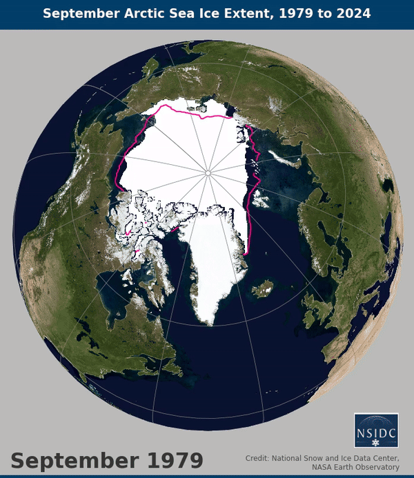
Sea Ice
Sea ice extent is the total area of the ocean’s surface that is covered by sea ice, and it has been declining at an alarming rate. Climate.gov provided a map and a graph to show us how the ice extent has been getting smaller over the years. The median extends from 1981-2010 compared to the median extent of 1991- 2020 was smaller and you can see the outline of the ice extent shrinking. The bottom graph displays the ice extend of each September from 1979-2024. From 1979 to 1998 you can see a small increase of the sea ice extent, but it starts to drop from 2000 to 2024. This shows how the ice keeps decreasing over time because the temperature of the Arctic keeps on increasing as time goes by.

My Example Using a Graph Bar:
I create a graph bar to show an example of visual representation on how we are losing sea ice over the years. I wanted to show an example with the code that I made, to show how every year there is a change on how much sea ice we end up losing. Sometimes Arctic temperature data can be confusing, so providing an example can help break the information to clarify the data.
data = {
'Year': [2010, 2011, 2012, 2013, 2014, 2015, 2016, 2017, 2018, 2019, 2020],
'Sea Ice Loss': [1.0, 1.2, 1.5, 1.3, 1.4, 1.6, 1.8, 1.7, 1.9, 2.0, 2.1] # Example loss values
}
df = pd.DataFrame(data)
# Plotting the bar graph
plt.figure(figsize=(10, 6))
plt.bar(df['Year'], df['Sea Ice Loss'], color='skyblue')
# Adding labels and title
plt.xlabel('Year')
plt.ylabel('Sea Ice Loss (Million Square Kilometers)')
plt.title('Sea Ice Loss in the Arctic Over Time')
plt.xticks(df['Year'], rotation=45)
# Display
plt.tight_layout()
plt.show()