import arcgis
from arcgis.gis import GIS
# Standard libraries
import os
import glob
import re
from zipfile import ZipFile
from dotenv import load_dotenv
import pprint
import requests
# Data manipulation and plotting
import pandas as pd
import numpy as np
import matplotlib.pyplot as plt
import matplotlib.colors as colors
from matplotlib.ticker import FuncFormatter
# Geospatial libraries
import geopandas as gpd
from arcgis.features import GeoAccessor, GeoSeriesAccessor
from arcgis.raster import Raster
import arcgis.mapping # For using WebMap, MapView, etc.
# Earthdata access
import earthaccess as ea
# IPUMS API and DDI access
from ipumspy.api import IpumsApiClient
from ipumspy import AggregateDataExtract, readers, ddi
from ipumspy import readers, ddi
from ipumspy.api.extract import NhgisDataset
import seaborn as sns
import matplotlib.pyplot as plt
from matplotlib.ticker import FuncFormatter
from shapely.geometry import Polygon
import folium Who is Exposed to Coastal Hazards in Puerto Rico?
Overview
This lesson introduces students to coastal hazards analysis in Puerto Rico using demographic and spatial data. You will use the Low Elevation Coastal Zones (LECZ) dataset from NASA SEDAC and census block group data from the US Census Bureau via the IPUMS National Historical Geographic Information System (NHGIS) portal to understand which populations live in low-lying areas vulnerable to flooding and sea level rise.
Learning Objectives
Through this hands-on activity, you will:
- Extract population and housing data for 2010 and 2020 using the IPUMS API.
- Preprocess and clean data using Python.
- Create statistical summaries and population pyramids by age and sex.
- Visualize patterns of population groups and vacancy in Puerto Rico’s counties.
- Perform a spatial overlay with LECZ boundaries to assess coastal exposure.
- Use Python packages to explore spatial patterns interactively.
- Generate Age pyrimids to compare population groups in and out of the LECZ.
This lesson emphasizes both data science skills and critical spatial reasoning about demographic vulnerability and environmental risk.
Introduction
Coastal zones are inherently hazardous because they are exposed to sea-level rise, storm surge, and recurrent flooding, and Puerto Rico’s concentration of people, housing, and infrastructure along the shoreline heightens that risk. These hazards impact not only the environment but also public health, economic stability, and the daily lives of residents, especially the elderly and other vulnerable groups. By connecting demographic data with exposure to LECZs, this study helps find out who is most at risk and why understanding coastal hazard vulnerability in Puerto Rico is important.
U.S. Census Geography
You may wonder why studies of the “entire” US often restrict themselves to the Continental U.S. (CONUS)? The simplest answer: data or computational limitations. Some U.S. territories lack full census variable coverage.
Several U.S. territories, including Puerto Rico, are frequently excluded from national analyses because of inconsistent or incomplete data coverage, as well as geospatial processing challenges. For example:
- The American Community Survey (ACS) is not conducted in U.S. territories.
- Housing detail is limited in Guam, Northern Mariana Islands, U.S. Virgin Islands, and American Samoa.
- Puerto Rico conducts its own Community Survey, separate from ACS.
Satellite-derived elevation data, such as NASA’s Shuttle Radar Topography Mission (SRTM), also suffer from variable accuracy near polar regions and small islands See this U.S. Census Bureau note for more..
Another possible reason for omission outside of CONUS could be computational challenges or limitations. For instance US territories are subject to different map projections, which implies the need for additional functions in processing algorithms to account for spatial variations and to unify spatial structures.
While these limitations explain why Puerto Rico is often left out of national right assessments, these regions are subject to environmental vulnerabilities. This lesson helps address these issues by showing how to combine demographic data with geospatial boundaries and Low Elevation Coastal Zones (LECZs) to assess who is most at risk from coastal hazards in Puerto Rico.
IPUMS and U.S. Census Geography
To support this analysis, we will use data from IPUMS, the Integrated Public Use Microdata Series. IPUMS is a long-standing data infrastructure project hosted at the University of Minnesota, which curates, harmonizes, and provides access to large-scale population and census datasets for research and education.
A key IPUMS resource is the National Historical Geographic Information System (NHGIS). NHGIS offers tabular census data and matching geographic boundary files (e.g., block groups, tracts, counties) going back to the 1790s. These data are essential for conducting spatial analysis of population, housing, and social change.
By using the API, you can create reproducible and automated workflows to study population vulnerability in places like Puerto Rico—regions that are too often overlooked in national assessments.
Low Elevation Coastal Zones (LECZs)
In this lesson, you will assess who is most exposed to coastal hazards by combining demographic data, geographic boundaries, and Low Elevation Coastal Zones (LECZs).
LECZs are areas of land located at or below a specified elevation threshold—commonly 5 meters or 10 meters above mean sea level. These zones have been globally mapped to estimate population exposure to sea-level rise and storm surge risks (McGranahan, Balk, and Anderson 2007; MacManus et al. 2021).
In the continental United States (CONUS), approximately 1 in 10 people live in the 10m LECZ. Research shows that exposure is not evenly distributed:
- Urban residents,
- People of color, and
- Older adults
are disproportionately located within these low-lying zones. For example, 1 in 5 urban Black residents lives in the 10m LECZ (Tagtachian and Balk 2023; Hauer et al. 2020).
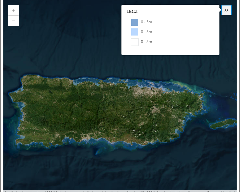
Below is a satellite preview of LECZ coverage in Puerto Rico:
Accessing Data
In this section, you’ll load the required Python libraries to work with census data, geospatial files, and visualization tools. These packages allow you to:
- Authenticate and extract data from the IPUMS API
- Manipulate and analyze tabular and spatial data
- Create maps and statistical graphics
- Work with ArcGIS-hosted feature layers and Earthdata content
Below is the full import block. Core packages are required; others are optional or used for extended functionality.
This lesson uses arcgis version of 2.4.0 or higher:
# Check the arcgis version for mapping properly
arcgis.__version__'2.4.1.3'If arcgis version is lower, use pip install:
pip install arcgis==2.4.1.1Using IPUMS API to access U.S Census Data for Puerto Rico
Registering to IPUMS and the National Historical Geographic Information System (NHGIS)
In order to retrieve an IPUMS API Key, you will have to register for an account for IPUMS and request your API Key. Additionally you must register to The National Historical Geographic Information System (NHGIS) to access Puerto Rico’s ACS data.
After you requested your IPUMS API, to the NHGIS, store it in os.env format. You will need your registration email and the API Key:
# # Step 1: Load environment variables
# load_dotenv()
# # Step 2: Retrieve API key from .env file
# IPUMS_API_KEY = os.getenv("IPUMS_API_KEY") # Replace with your actual key name if different
# # Step 3: Validate that the key was loaded
# if IPUMS_API_KEY is None:
# raise ValueError("API key not found. Ensure 'IPUMS_API_KEY' is set in your .env file.")
# # Step 4: Initialize the IPUMS API client
# ipums = IpumsApiClient(IPUMS_API_KEY)Downlaoding shapefiles from IPUMS
Before downloading spatial data, we need to identify the correct shapefile name for our area of interest—in this case, Puerto Rico block groups for 2010
The code below queries the NHGIS metadata catalog using the IPUMS API and lists matching shapefiles based on geography, level, and year.
# Search IPUMS NHGIS metadata for shapefiles related to Puerto Rico block groups (2010)
for page in ipums.get_metadata_catalog("nhgis", metadata_type="shapefiles"):
for shapefile in page["data"]:
if (
shapefile["extent"] == "Puerto Rico"
and shapefile["geographicLevel"] == "Block Group"
and shapefile["year"] == "2010"
):
print(f"Name: {shapefile['name']} | Year: {shapefile['year']}")Name: 720_blck_grp_2010_tl2010 | Year: 2010
Name: 720_blck_grp_2010_tl2020 | Year: 2010With this API key, we can extract geospatial data from the IPUMS API. Using the geo level blck_grp, we can speicify that we want to extract data at the Block Group level.
The AggregateDataExtract function specifies the collection to use, in this case NHGIS, give it a human-readable label for the extract request, and requests the 2010 and 2020 Summary File 1 (SF1a) dataset with tables P12 (sex by age) and H3 (vacancy status) at the block group geographic level. It also limits the extract to geographic extent code “720” (Puerto Rico).
Getting data from 2010 and 2020 with the variables for 5-year Age Groups (P12) and Housing (H3).
# Submit extraction data to IPUMS portal
extract = AggregateDataExtract(
collection="nhgis", # Use NHGIS collection
description="Puerto Rico 2010–2020 vacancy", # Extract label
datasets=[
NhgisDataset(
name="2010_SF1a", # 2010 dataset
data_tables=["P12", "H3"], # Tables: sex by age, vacancy
geog_levels=["blck_grp"] # At block group level
),
NhgisDataset(
name="2020_DHCa", # 2020 dataset
data_tables=["P12", "H3"], # Same tables
geog_levels=["blck_grp"] # Same level
),
],
geographic_extents=["720"] # Puerto Rico only
# shapefiles=["720_blck_grp_2020_tl2020"] # Optional: include shapefile
)This code sends the extract request to IPUMS, prints the unique extract ID so you can track it, and sets up to wait until the extract is finished.
# Submit the extract request
ipums.submit_extract(extract) # Send request to IPUMS
print(f"Extract ID: {extract.extract_id}") # Print the extract ID
# Wait for the extract to finishThis code sets up the folder where the extract will be saved, creates it if it doesn’t already exist, and downloads the extract from IPUMS to that location:
# Download the extract
current = os.getcwd() # Get current working directory
DOWNLOAD_DIR = os.path.join(f"{current}/data/ipums/block") # Set download path
os.makedirs(DOWNLOAD_DIR, exist_ok=True) # Create folder if needed
ipums.download_extract(extract, download_dir=DOWNLOAD_DIR) # Download files to folderAfter downloading the extract, this code navigates to the download directory, identifies the ZIP file containing the CSV data, and inspects its contents. It then locates the specific CSV files for the years 2010 and 2020 using filename patterns, and reads them directly from the ZIP archive into pandas DataFrames—no need to manually unzip anything!
current = os.getcwd() # Get current working directory
DOWNLOAD_DIR = os.path.join(f"{current}/data/ipums/block") # Set path to downloaded extract
file_list = os.listdir(DOWNLOAD_DIR) # List files in download folder
csv_zip = [f for f in file_list if f.endswith('_csv.zip')]
file_list['nhgis0012_csv', '.DS_Store', 'nhgis0013_shape']current = os.getcwd() # Get current working directory
DOWNLOAD_DIR = os.path.join(current, "data/ipums/block") # Path to downloaded extract
file_list = os.listdir(DOWNLOAD_DIR) # List files in download folder
# ---- Case 1: ZIP file ----
csv_zip = [f for f in file_list if f.endswith('_csv.zip')]
if csv_zip: # If we found a zip file
csv_path = os.path.join(DOWNLOAD_DIR, csv_zip[0])
print(f"Found zip file: {csv_path}")
with ZipFile(csv_path) as z:
csv_data = z.namelist()
print("Contents of zip:", csv_data)
# Find the CSVs
file_2020 = next(f for f in csv_data if '2020' in f and f.endswith('.csv'))
file_2010 = next(f for f in csv_data if '2010' in f and f.endswith('.csv'))
# Read into DataFrames
with z.open(file_2020) as f:
df_2020 = pd.read_csv(f)
with z.open(file_2010) as f:
df_2010 = pd.read_csv(f)
# ---- Case 2: FOLDER ending in "_csv" ----
else:
csv_folders = [f for f in file_list if f.endswith('_csv') and os.path.isdir(os.path.join(DOWNLOAD_DIR, f))]
if not csv_folders:
raise FileNotFoundError("No _csv.zip file or _csv folder found in the download directory.")
csv_folder = os.path.join(DOWNLOAD_DIR, csv_folders[0])
print(f"Found folder: {csv_folder}")
folder_files = os.listdir(csv_folder)
print("Contents of folder:", folder_files)
# Find and read the CSVs
file_2020 = next(f for f in folder_files if '2020' in f and f.endswith('.csv'))
file_2010 = next(f for f in folder_files if '2010' in f and f.endswith('.csv'))
df_2020 = pd.read_csv(os.path.join(csv_folder, file_2020))
df_2010 = pd.read_csv(os.path.join(csv_folder, file_2010))
print("Data loaded successfully!")
print("2020 shape:", df_2020.shape)
print("2010 shape:", df_2010.shape)Found folder: /Users/CIESINIT/Documents/SCHOOL/TOPSTSCHOOL-disasters/data/ipums/block/nhgis0012_csv
Contents of folder: ['nhgis0012_ds258_2020_blck_grp_codebook.txt', 'nhgis0012_ds172_2010_blck_grp.csv', 'nhgis0012_ds258_2020_blck_grp.csv', 'nhgis0012_ds172_2010_blck_grp_codebook.txt']
Data loaded successfully!
2020 shape: (242335, 111)
2010 shape: (220334, 110)Cleaning and processing IPUMS data
This section uses NHGIS Codebook file(s) that were automatically included in your data extract to rename cryptic column codes in the 2010 and 2020 datasets to human-readable labels. These codes correspond to census tables on sex by age and housing occupancy. Renaming makes analysis and visualization much easier later in your workflow.
Look for the .txt file(s) in the zipped file you downloaded, and they will shed some light on your data.
# The NHGIS codes are as follows in the documentation which is downloaded from the IPUMS API
# Rename columns for dataframe 2020
''' Table 1: Sex by Age for Selected Age Categories
Universe: Total population
Source code: P12
NHGIS code: U7S
U7S001: Total
U7S002: Male
U7S003: Male: Under 5 years
U7S004: Male: 5 to 9 years
U7S005: Male: 10 to 14 years
U7S006: Male: 15 to 17 years
U7S007: Male: 18 and 19 years
U7S008: Male: 20 years
U7S009: Male: 21 years
U7S010: Male: 22 to 24 years
U7S011: Male: 25 to 29 years
U7S012: Male: 30 to 34 years
U7S013: Male: 35 to 39 years
U7S014: Male: 40 to 44 years
U7S015: Male: 45 to 49 years
U7S016: Male: 50 to 54 years
U7S017: Male: 55 to 59 years
U7S018: Male: 60 and 61 years
U7S019: Male: 62 to 64 years
U7S020: Male: 65 and 66 years
U7S021: Male: 67 to 69 years
U7S022: Male: 70 to 74 years
U7S023: Male: 75 to 79 years
U7S024: Male: 80 to 84 years
U7S025: Male: 85 years and over
U7S026: Female
U7S027: Female: Under 5 years
U7S028: Female: 5 to 9 years
U7S029: Female: 10 to 14 years
U7S030: Female: 15 to 17 years
U7S031: Female: 18 and 19 years
U7S032: Female: 20 years
U7S033: Female: 21 years
U7S034: Female: 22 to 24 years
U7S035: Female: 25 to 29 years
U7S036: Female: 30 to 34 years
U7S037: Female: 35 to 39 years
U7S038: Female: 40 to 44 years
U7S039: Female: 45 to 49 years
U7S040: Female: 50 to 54 years
U7S041: Female: 55 to 59 years
U7S042: Female: 60 and 61 years
U7S043: Female: 62 to 64 years
U7S044: Female: 65 and 66 years
U7S045: Female: 67 to 69 years
U7S046: Female: 70 to 74 years
U7S047: Female: 75 to 79 years
U7S048: Female: 80 to 84 years
U7S049: Female: 85 years and over
Table 2: Occupancy Status
Universe: Housing units
Source code: H3
NHGIS code: U9X
U9X001: Total
U9X002: Occupied
U9X003: Vacant
'''
rename_2020 = {
"U7S001": "Total_Population",
"U7S002": "Male",
"U7S003": "Male: Under 5 years",
"U7S004": "Male: 5 to 9 years",
"U7S005": "Male: 10 to 14 years",
"U7S006": "Male: 15 to 17 years",
"U7S007": "Male: 18 and 19 years",
"U7S008": "Male: 20 years",
"U7S009": "Male: 21 years",
"U7S010": "Male: 22 to 24 years",
"U7S011": "Male: 25 to 29 years",
"U7S012": "Male: 30 to 34 years",
"U7S013": "Male: 35 to 39 years",
"U7S014": "Male: 40 to 44 years",
"U7S015": "Male: 45 to 49 years",
"U7S016": "Male: 50 to 54 years",
"U7S017": "Male: 55 to 59 years",
"U7S018": "Male: 60 and 61 years",
"U7S019": "Male: 62 to 64 years",
"U7S020": "Male: 65 and 66 years",
"U7S021": "Male: 67 to 69 years",
"U7S022": "Male: 70 to 74 years",
"U7S023": "Male: 75 to 79 years",
"U7S024": "Male: 80 to 84 years",
"U7S025": "Male: 85 years and over",
"U7S026": "Female",
"U7S027": "Female: Under 5 years",
"U7S028": "Female: 5 to 9 years",
"U7S029": "Female: 10 to 14 years",
"U7S030": "Female: 15 to 17 years",
"U7S031": "Female: 18 and 19 years",
"U7S032": "Female: 20 years",
"U7S033": "Female: 21 years",
"U7S034": "Female: 22 to 24 years",
"U7S035": "Female: 25 to 29 years",
"U7S036": "Female: 30 to 34 years",
"U7S037": "Female: 35 to 39 years",
"U7S038": "Female: 40 to 44 years",
"U7S039": "Female: 45 to 49 years",
"U7S040": "Female: 50 to 54 years",
"U7S041": "Female: 55 to 59 years",
"U7S042": "Female: 60 and 61 years",
"U7S043": "Female: 62 to 64 years",
"U7S044": "Female: 65 and 66 years",
"U7S045": "Female: 67 to 69 years",
"U7S046": "Female: 70 to 74 years",
"U7S047": "Female: 75 to 79 years",
"U7S048": "Female: 80 to 84 years",
"U7S049": "Female: 85 years and over",
"U9X001": "Total_Housing_Units",
"U9X002": "Occupied",
"U9X003": "Vacant"
}
#Rename columns for dataframe 2010
''' Table 1: Housing Units
Universe: Housing units
Source code: H1
NHGIS code: IFC
IFC001: Total
Table 2: Occupancy Status
Universe: Housing units
Source code: H3
NHGIS code: IFE
IFE001: Total
IFE002: Occupied
IFE003: Vacant'''
rename_2010 = {
"H76001": "Total_Population",
"H76002": "Male",
"H76003": "Male: Under 5 years",
"H76004": "Male: 5 to 9 years",
"H76005": "Male: 10 to 14 years",
"H76006": "Male: 15 to 17 years",
"H76007": "Male: 18 and 19 years",
"H76008": "Male: 20 years",
"H76009": "Male: 21 years",
"H76010": "Male: 22 to 24 years",
"H76011": "Male: 25 to 29 years",
"H76012": "Male: 30 to 34 years",
"H76013": "Male: 35 to 39 years",
"H76014": "Male: 40 to 44 years",
"H76015": "Male: 45 to 49 years",
"H76016": "Male: 50 to 54 years",
"H76017": "Male: 55 to 59 years",
"H76018": "Male: 60 and 61 years",
"H76019": "Male: 62 to 64 years",
"H76020": "Male: 65 and 66 years",
"H76021": "Male: 67 to 69 years",
"H76022": "Male: 70 to 74 years",
"H76023": "Male: 75 to 79 years",
"H76024": "Male: 80 to 84 years",
"H76025": "Male: 85 years and over",
"H76026": "Female",
"H76027": "Female: Under 5 years",
"H76028": "Female: 5 to 9 years",
"H76029": "Female: 10 to 14 years",
"H76030": "Female: 15 to 17 years",
"H76031": "Female: 18 and 19 years",
"H76032": "Female: 20 years",
"H76033": "Female: 21 years",
"H76034": "Female: 22 to 24 years",
"H76035": "Female: 25 to 29 years",
"H76036": "Female: 30 to 34 years",
"H76037": "Female: 35 to 39 years",
"H76038": "Female: 40 to 44 years",
"H76039": "Female: 45 to 49 years",
"H76040": "Female: 50 to 54 years",
"H76041": "Female: 55 to 59 years",
"H76042": "Female: 60 and 61 years",
"H76043": "Female: 62 to 64 years",
"H76044": "Female: 65 and 66 years",
"H76045": "Female: 67 to 69 years",
"H76046": "Female: 70 to 74 years",
"H76047": "Female: 75 to 79 years",
"H76048": "Female: 80 to 84 years",
"H76049": "Female: 85 years and over",
"IFC001": "Total_Housing",
"IFE001": "Total_Housing_Units",
"IFE002": "Occupied",
"IFE003": "Vacant"
}
# Apply renaming to both datasets
df_2010.rename(columns=rename_2010, inplace=True) # Rename 2010 columns
df_2020.rename(columns=rename_2020, inplace=True) # Rename 2020 columnsThis step filters both datasets to include only records from Puerto Rico, which is identified in the IPUMS data by STATEA == 72. It also removes any columns that are completely empty (all values are NaN), which helps clean up the data for analysis.
# Subset Puerto Rico (STATEA code 72)
pr_df_2010 = df_2010[df_2010["STATEA"] == 72] # Filter 2010 data for Puerto Rico
pr_df_2020 = df_2020[df_2020["STATEA"] == 72] # Filter 2020 data for Puerto Rico
# Drop columns with all missing values
pr_df_2010 = pr_df_2010.dropna(axis=1, how='all') # Clean 2010 data
pr_df_2020 = pr_df_2020.dropna(axis=1, how='all') # Clean 2020 dataThis step calculates the total population aged 60 and over (Population 60+) by summing the relevant male and female age group columns. It then computes two new indicators for both 2010 and 2020:
Pop60pRatio: the share of the total population that is 60+VacantRatio: the share of housing units that are vacant
These ratios help measure aging and housing vacancy patterns in Puerto Rico over time.
# Define age columns for population 60+
pop60plus_cols = [
"Female: 60 and 61 years",
"Female: 62 to 64 years",
"Female: 65 and 66 years",
"Female: 67 to 69 years",
"Female: 70 to 74 years",
"Female: 75 to 79 years",
"Female: 80 to 84 years",
"Female: 85 years and over",
"Male: 60 and 61 years",
"Male: 62 to 64 years",
"Male: 65 and 66 years",
"Male: 67 to 69 years",
"Male: 70 to 74 years",
"Male: 75 to 79 years",
"Male: 80 to 84 years",
"Male: 85 years and over"
]
# Calculate totals and ratios for 2010
pr_df_2010["Pop60plus_total"] = pr_df_2010[pop60plus_cols].sum(axis=1) # Sum 60+ pop
pr_df_2010["Pop60pRatio"] = pr_df_2010["Pop60plus_total"] / pr_df_2010["Total_Population"] # 60+ share
pr_df_2010["VacantRatio"] = pr_df_2010["Vacant"] / pr_df_2010["Total_Housing_Units"] # Vacancy share
# Calculate totals and ratios for 2020
pr_df_2020["Pop60plus_total"] = pr_df_2020[pop60plus_cols].sum(axis=1)
pr_df_2020["Pop60pRatio"] = pr_df_2020["Pop60plus_total"] / pr_df_2020["Total_Population"]
pr_df_2020["VacantRatio"] = pr_df_2020["Vacant"] / pr_df_2020["Total_Housing_Units"]Exploring data with graphs
Compare two variables in Scatterplot
To explore the relationship between Population 60+ and housing vacancy, we’ll create a scatter plot using data from 2010. Each point represents a block group in Puerto Rico:
- The x-axis shows the vacant housing ratio
- The y-axis shows the Population 60+ ratio
This kind of visualization helps reveal spatial patterns or clusters related to population 60+ and housing dynamics.
# Plot Aged Ratio vs. Vacant Ratio for 2010
plt.scatter(pr_df_2010["VacantRatio"], pr_df_2010["Pop60pRatio"], alpha=0.3) # Transparent points
plt.title("Puero Rico Population 60 + Ratio over Vacancy Ratio, 2010") # Plot title
plt.xlabel("Vacant Ratio") # X-axis label
plt.ylabel("Population 60+ Ratio") # Y-axis label
plt.grid(True) # Show grid
plt.tight_layout() # Adjust layout
plt.show() # Display plot
Generating Population Pyramids
Another useful way to analyze popylation is with population pyramids for Puerto Rico using male and female population by age group, based on census block-level data. The pyramid compares the age structure visually between sexes, helping identify trends like population aging or gender imbalances in specific cohorts.
Key Steps in the Code:
First, Extract age-by-sex columns from the dataset.
# Define the relevant columns
pyramid_columns_2010 = [col for col in pr_df_2010.columns if col.startswith("Male:") or col.startswith("Female:")]
pyramid_columns_2020 = [col for col in pr_df_2020.columns if col.startswith("Male:") or col.startswith("Female:")]We can cambine narrow age bands into broader, more interpretable age groups (like 15–19 or 20–24) to improve the readability of the population pyramid.
In the plot, we manually add percentages for adjacent rows as the age group label.
After combining, it prepares the data for bidirectional horizontal bar plotting by making male values negative (so they show on the left), keeping female values positive (on the right), and creating helper columns for width and placement of bars.
def combine_age_groups(df, male_prefix="Male: ", female_prefix="Female: "):
# Define the custom age groupings
age_groups = {
"Under 5 years": ["Under 5 years"],
"5 to 9 years": ["5 to 9 years"],
"10 to 14 years": ["10 to 14 years"],
"15 to 19 years": ["15 to 17 years", "18 and 19 years"],
"20 to 24 years": ["20 years", "21 years", "22 to 24 years"],
"25 to 29 years": ["25 to 29 years"],
"30 to 34 years": ["30 to 34 years"],
"35 to 39 years": ["35 to 39 years"],
"40 to 44 years": ["40 to 44 years"],
"45 to 49 years": ["45 to 49 years"],
"50 to 54 years": ["50 to 54 years"],
"55 to 59 years": ["55 to 59 years"],
"60 to 64 years": ["60 and 61 years", "62 to 64 years"],
"65 to 69 years": ["65 and 66 years", "67 to 69 years"],
"70 to 74 years": ["70 to 74 years"],
"75 to 79 years": ["75 to 79 years"],
"80 to 84 years": ["80 to 84 years"],
"85 years and over": ["85 years and over"]
}
# Aggregate by age groups
rows = []
for label, group in age_groups.items():
male_cols = [male_prefix + g for g in group if male_prefix + g in df.columns]
female_cols = [female_prefix + g for g in group if female_prefix + g in df.columns]
male_total = df[male_cols].sum().sum() if male_cols else 0
female_total = df[female_cols].sum().sum() if female_cols else 0
rows.append({
"Age": label,
"Male": male_total,
"Female": female_total
})
pyramid = pd.DataFrame(rows)
# Prepare for horizontal bar plotting
pyramid["Female_Left"] = 0
pyramid["Female_Width"] = pyramid["Female"]
pyramid["Male_Left"] = -pyramid["Male"]
pyramid["Male_Width"] = pyramid["Male"]
return pyramidTo prepare for visualizing population structure, we first apply the combine_age_groups() function to our cleaned census data for 2010 and 2020. This step transforms narrow age bands into broader, more interpretable categories and reshapes the data for plotting population pyramids.
pyramid_2010 = combine_age_groups(pr_df_2010) #use defined function and apply the dataframe `pr_df_2010`
pyramid_2020 = combine_age_groups(pr_df_2020) #use defined function and apply the dataframe `pr_df_2020`The function below creates a horizontal population pyramid to compare Puerto Rico’s population structure in 2010 and 2020. Each bar represents the total population within a given age group, broken down by sex:
- Male values are shown on the left .
- Female values are shown on the right.
- Lighter colors represent 2010, and darker colors represent 2020.
Custom axis formatting, color palettes, and layout tweaks are used to enhance visual clarity.
# Format axis ticks to show positive labels for both male and female sides
def abs_tick(x, pos):
return f"{abs(int(x)):,}"
def plot_pyramid_2010_vs_2020(pyramid_2010, pyramid_2020, title="Population Pyramid (2010 vs 2020)"):
# Extract age group labels and set bar positions
age_labels = pyramid_2010["Age"]
y = np.arange(len(age_labels)) # One row per age group
bar_height = 0.35 # Half-height bars for side-by-side comparison
fig, ax = plt.subplots()
# Colors: 2010 (light), 2020 (dark)
male_colors = ["#c6dbef", "#2171b5"] # Blues
female_colors = ["#fdd0a2", "#e6550d"] # Oranges
# Plot Male bars (left)
ax.barh(y - bar_height, -pyramid_2010["Male"], height=bar_height, color=male_colors[0], label="Male 2010")
ax.barh(y, -pyramid_2020["Male"], height=bar_height, color=male_colors[1], label="Male 2020")
# Plot Female bars (right)
ax.barh(y - bar_height, pyramid_2010["Female"], height=bar_height, color=female_colors[0], label="Female 2010")
ax.barh(y, pyramid_2020["Female"], height=bar_height, color=female_colors[1], label="Female 2020")
# Format axes
ax.set_yticks(y - bar_height / 2)
ax.set_yticklabels(age_labels)
# Add vertical axis line at center
ax.axvline(0, color="gray", lw=0.8)
# Format x-axis with absolute values for readability
ax.xaxis.set_major_formatter(FuncFormatter(abs_tick))
# Add light grid lines to x-axis
ax.grid(axis='x', linestyle='--', linewidth=0.5, alpha=0.5)
# Dynamically set x-axis limits based on the largest population value
max_val = max(
pyramid_2010[["Male", "Female"]].values.max(),
pyramid_2020[["Male", "Female"]].values.max()
)
ax.set_xlim(-max_val * 1.1, max_val * 1.1)
# Add chart title and axis labels
ax.set_title(title)
ax.set_xlabel("Population")
ax.set_ylabel("Age Group")
# Add legend
ax.legend(loc="lower right")
# Adjust layout to prevent label cutoff
plt.tight_layout()
plt.show()To generate the population pyramid comparing Puerto Rico in 2010 and 2020, we call the plotting function and pass in the pre-processed DataFrames.
# Plot population pyramid comparing Puerto Rico (2010 vs 2020)
plot_pyramid_2010_vs_2020(pyramid_2010, pyramid_2020, title="Puerto Rico Population Pyramid (2010 vs 2020)")
Visualizing Population 60+ in a Single County
To compare demographic structure at a finer spatial scale, you can generate a population pyramid for any individual municipio (county) in Puerto Rico. The steps below demonstrate how to do this for Arecibo Municipio.
#show unique names of COUNTY column
print(pr_df_2010["COUNTY"].unique())['Adjuntas Municipio' 'Aguada Municipio' 'Aguadilla Municipio'
'Aguas Buenas Municipio' 'Aibonito Municipio' 'Añasco Municipio'
'Arecibo Municipio' 'Arroyo Municipio' 'Barceloneta Municipio'
'Barranquitas Municipio' 'Bayamón Municipio' 'Cabo Rojo Municipio'
'Caguas Municipio' 'Camuy Municipio' 'Canóvanas Municipio'
'Carolina Municipio' 'Cataño Municipio' 'Cayey Municipio'
'Ceiba Municipio' 'Ciales Municipio' 'Cidra Municipio' 'Coamo Municipio'
'Comerío Municipio' 'Corozal Municipio' 'Culebra Municipio'
'Dorado Municipio' 'Fajardo Municipio' 'Florida Municipio'
'Guánica Municipio' 'Guayama Municipio' 'Guayanilla Municipio'
'Guaynabo Municipio' 'Gurabo Municipio' 'Hatillo Municipio'
'Hormigueros Municipio' 'Humacao Municipio' 'Isabela Municipio'
'Jayuya Municipio' 'Juana Díaz Municipio' 'Juncos Municipio'
'Lajas Municipio' 'Lares Municipio' 'Las Marías Municipio'
'Las Piedras Municipio' 'Loíza Municipio' 'Luquillo Municipio'
'Manatí Municipio' 'Maricao Municipio' 'Maunabo Municipio'
'Mayagüez Municipio' 'Moca Municipio' 'Morovis Municipio'
'Naguabo Municipio' 'Naranjito Municipio' 'Orocovis Municipio'
'Patillas Municipio' 'Peñuelas Municipio' 'Ponce Municipio'
'Quebradillas Municipio' 'Rincón Municipio' 'Río Grande Municipio'
'Sabana Grande Municipio' 'Salinas Municipio' 'San Germán Municipio'
'San Juan Municipio' 'San Lorenzo Municipio' 'San Sebastián Municipio'
'Santa Isabel Municipio' 'Toa Alta Municipio' 'Toa Baja Municipio'
'Trujillo Alto Municipio' 'Utuado Municipio' 'Vega Alta Municipio'
'Vega Baja Municipio' 'Vieques Municipio' 'Villalba Municipio'
'Yabucoa Municipio' 'Yauco Municipio']Select and change the COUNTY you want to plot below:
#Filter 2010 and 2020 datasets to only include Arecibo Municipio
county_df_2010 = pr_df_2010[pr_df_2010["COUNTY"] == "Arecibo Municipio"]
county_df_2020 = pr_df_2020[pr_df_2020["COUNTY"] == "Arecibo Municipio"]
# Combine narrow age bands into broader categories for plotting
county_pyr_2010 = combine_age_groups(county_df_2010)
county_pyr_2020 = combine_age_groups(county_df_2020)
#Plot population pyramid for Arecibo Municipio
plot_pyramid_2010_vs_2020(county_pyr_2010, county_pyr_2020, "Arecibo, PR, Population Pyramid (2010 vs 2020)")
Municipio (County) analysis
To compare demographic patterns at the municipio (county) level, we need to aggregate block group-level data up to the county level.
The code below defines a helper function that:
- Sums total population, housing units, and selected variables by county
- Aggregates all age/sex columns needed for further analysis (like population pyramids)
# Define a function to aggregate data from block group to county (municipio) level
def aggregate_to_county(df, county_col="COUNTY", male_prefix="Male", female_prefix="Female", additional_cols=None):
if additional_cols is None:
# Specify default columns to aggregate if not provided
additional_cols = [
'Total_Population', 'Total_Housing_Units',
'Occupied', 'Vacant', 'Pop60plus_total'
]
# Identify all male and female population columns by prefix
population_cols = [col for col in df.columns if col.startswith(male_prefix) or col.startswith(female_prefix)]
# Filter to additional columns that actually exist in the input DataFrame
valid_additional_cols = [col for col in additional_cols if col in df.columns]
# Final list of columns to group and aggregate
group_cols = [county_col] + valid_additional_cols + population_cols
# Group by county and sum all selected columns
df_aggregated = df[group_cols].groupby(county_col, as_index=False).sum()
return df_aggregatedNow we apply the function to both the 2010 and 2020 datasets to produce county-level summaries.
# Apply the aggregation function to the 2010 data
county_df_2010 = aggregate_to_county(pr_df_2010)
# Apply the aggregation function to the 2020 data
county_df_2020 = aggregate_to_county(pr_df_2020)Merginig Datasets
To enable side-by-side comparisons between 2010 and 2020, we merge the two county-level datasets. This allows us to compute changes in key indicators like total population, population 60+, and vacant housing units.
We use "COUNTY" as the merge key (geographic identifier) and apply suffixes to distinguish columns from the two years.
The resulting merged_df DataFrame contains side-by-side values for both years, using suffixes to distinguish 2010 and 2020 columns.
# Merge 2020 data with selected 2010 columns using GISJOIN
merged_df = county_df_2020.merge(
county_df_2010,
on="COUNTY", # Join on geographic ID
how="inner", # Keep only matching rows
suffixes=("_2020", "_2010") # Label columns by year
)Comparing Time Series
To evaluate demographic and housing shifts between 2010 and 2020, we calculate both absolute and percentage changes in key indicators at the county level.
This includes: - Total population - Population 60+ - Vacant housing units
By comparing these metrics across decades, we can detect trends such as population decline, housing vacancy growth, and shifts in the share of older adults.
The code below creates new columns in the merged_df DataFrame to store the absolute and percent changes for each indicator. Division-by-zero cases are handled safely using .where()
# Calculate absolute changes between 2010 and 2020
merged_df["Total_Pop_Change"] = merged_df["Total_Population_2020"] - merged_df["Total_Population_2010"] # Change in total population
merged_df["Pop60plus_Change"] = merged_df["Pop60plus_total_2020"] - merged_df["Pop60plus_total_2010"] # Change in 60+ population
merged_df["Vacant_Change"] = merged_df["Vacant_2020"] - merged_df["Vacant_2010"] # Change in vacant units
# Avoid division by zero using .where()
merged_df["Total_Pop_Change_Pct"] = (
(merged_df["Total_Population_2020"] - merged_df["Total_Population_2010"]) /
merged_df["Total_Population_2010"].where(merged_df["Total_Population_2010"] != 0)
) * 100
merged_df["Pop60plus_Change_Pct"] = (
(merged_df["Pop60plus_total_2020"] - merged_df["Pop60plus_total_2010"]) /
merged_df["Pop60plus_total_2010"].where(merged_df["Pop60plus_total_2010"] != 0)
) * 100
merged_df["Vacant_Change_Pct"] = (
(merged_df["Vacant_2020"] - merged_df["Vacant_2010"]) /
merged_df["Vacant_2010"].where(merged_df["Vacant_2010"] != 0)
) * 100By looking more closely at the graphs and comparing vacancy differences between 2010 and 2020, it becomes evident that quantile-based classification may not accurately reflect true differences across areas. In cases with extreme outliers, quantile breaks can distort interpretation.
Math Refresher
A z-score tells us how many standard deviations a value is from the mean. A positive z-score means the value is above the mean. A negative z-score means it’s below the mean. Z-scores help us compare variables on different scales and identify outliers—typically anything above +2 or below –2 is considered unusually high or low.
To better evaluate how unusual each area’s change is, we compute z-scores for each variable. This standardizes the values by subtracting the mean and dividing by the standard deviation, allowing for comparisons across indicators on a consistent scale.
# Compute means and standard deviations
means = merged_df[["Pop60plus_Change_Pct", "Vacant_Change_Pct" ]].mean()
stds = merged_df[["Pop60plus_Change_Pct", "Vacant_Change_Pct" ]].std()
# Create z-score columns
for var in ["Pop60plus_Change_Pct", "Vacant_Change_Pct" ]:
z_col = var.replace("_Change_Pct", "_dz")
merged_df[z_col] = (merged_df[var] - means[var]) / stds[var]Plotting Graphs from IPUMS data:
To visually explore the relationships between key demographic and housing changes from 2010 to 2020, we use a Seaborn pairplot(). This plot creates:
- Scatterplots for each pair of variables to reveal possible correlations
- Histograms along the diagonal to show the distribution of each variable
This is a quick way to identify patterns such as population decline, growth in the 60+ population, or rising housing vacancy across Puerto Rico’s counties.
This pairplot function uses the z-score standardized versions of the change variables to compare their relative behavior across Block Groups in a scatterplot matrix.
By putting all variables on the same scale (mean = 0, std = 1), we can asily spot strong linear relationships, identify clusters or outliers, and ompare change intensity across different domains (e.g., aging vs. vacancy).
This is especially useful when your original variables had different units or ranges.
Can you spot any linear trends in the scatterplots?
# Select key columns to compare
plot_vars = [
"Total_Pop_Change_Pct", # % change in total population
"Pop60plus_Change_Pct", # % change in population 60+
"Vacant_Change_Pct", # % change in vacant housing units
"Total_Population_2020", # Population in 2020
"Total_Population_2010" # Population in 2010
]
# Generate pairwise scatterplots with histograms on the diagonal
sns.pairplot(
merged_df[plot_vars],
diag_kind="hist",
corner=True, # Show only lower triangle
plot_kws=dict(marker="o", facecolors='none', edgecolors='blue')
)
# Add overall title and adjust layout
plt.suptitle("Pairwise Scatterplots and Histograms (2010–2020 Changes)", y=1.02)
plt.tight_layout()
plt.show()
Comparing Counties Spatially
To fully understand how population and housing trends vary across Puerto Rico’s counties, we need to combine attribute data (e.g., census population values) with spatial boundaries.
In this section, we will: - Use the arcgis Python package to access a hosted feature layer from ArcGIS Online containing county (municipio) geometries for Puerto Rico. - Merge this geometry with our 2010–2020 demographic dataset to form a Spatially Enabled DataFrame (SEDF) ready for mapping. - Create an interactive map that classifies counties based on changes in population 60+. - Overlay the Low Elevation Coastal Zone (LECZ) polygon layer to highlight which counties intersect with flood-prone coastal zones. - Generate a second map to visualize LECZ exposure and examine spatial patterns.
This spatial analysis allows us to move beyond raw tables and visually explore which areas are experiencing population shifts, housing vacancies, and environmental vulnerability in tandem.
Interact with ArcGIS Online Portal
To retrieve official county boundaries for Puerto Rico, we use the arcgis Python package to access a “hosted feature layer” from ArcGIS Online. This layer includes U.S. county geometries from the 2020 Census.
We filter the layer to include only features where STATEFP = '72', which corresponds to Puerto Rico, and convert the result into a Spatially Enabled DataFrame (SEDF) for further analysis.
# Get the layer from the published data
# Connect to ArcGIS Online (anonymous session)
gis = GIS()
# Access a specific hosted feature layer by its Item ID
layer = gis.content.get("3132216944b249a08d13b1aa0ee6fda2").layers[0] # PR counties 2020 layer
# Query Puerto Rico counties using the state FIPS code '72'
sedf = layer.query(where="STATEFP = '72'").sdf # Convert to Spatially Enabled DataFrameWe can merge the spatial county feature layer for Puerto Rico (2020) with your demographic data (2010–2020) using the COUNTY field as a common geographic identifier. The result, pr_sedf_ipums, is a Spatially Enabled DataFrame that contains both geometry and attribute data—making it ready for mapping or spatial analysis!
#Merge the feature to the merged 2010-2020 df
print("`merged_df` DataFrame row count before table join: ", len(merged_df))
pr_sedf_ipums = sedf.merge(merged_df, left_on="NAMELSAD", right_on="COUNTY", how = "inner")
print("`pr_sedf_ipums` DataFrame results after table join: ", len(pr_sedf_ipums))`merged_df` DataFrame row count before table join: 78
`pr_sedf_ipums` DataFrame results after table join: 78Now that we’ve merged demographic data with county geometries, we can use arcgis to create an interactive choropleth map. The map classifies Puerto Rico’s counties based on z-scores of Population 60+ change (Pop60plus_dz).
## Set up an interactive map centered on Puerto Rico
gis = GIS()
m = gis.map("Puerto Rico")
# Define classification settings for choropleth
num_classes = 5 # Number of quantile classes
field = "Pop60plus_dz" # Field to visualize (z-score of 60+ population change)
column_values = pr_sedf_ipums[field].dropna() # Drop missing values
# Create class breaks using quantiles
breaks = list(np.quantile(column_values, np.linspace(0, 1, num_classes + 1)))
# Define a color palette (RdBu reversed)
colors = ["#d73027", "#fc8d59", "#fee090", "#91bfdb", "#4575b4"]
# Build a renderer to style the polygons
renderer = {
"type": "classBreaks",
"field": field,
"classificationMethod": "esriClassifyQuantile",
"minValue": float(min(column_values)),
"classBreakInfos": [
{
"classMaxValue": float(breaks[i + 1]),
"label": f"{breaks[i]:.2f} – {breaks[i+1]:.2f}",
"description": "",
"symbol": {
"type": "esriSFS",
"style": "esriSFSSolid",
"color": list(int(c.lstrip("#")[i:i+2], 16) for i in (0, 2, 4)) + [180], # RGBA color
"outline": {
"color": [0, 0, 0, 40],
"width": 0.4,
"type": "esriSLS",
"style": "esriSLSSolid"
}
}
}
for i, c in enumerate(colors)
]
}
# Plot the spatial data with the custom renderer
pr_sedf_ipums.spatial.plot(
map_widget=m,
renderer=renderer,
legend=True
)
# Enable legend display
m.legend.enabled = True
# Display the interactive map
mMap of relative change in population 60+ in Puerto Rico’s Municipios. Red representing high values and blue representing low values.
Low Elevation Coastal Zone Spatial Analysis with IPUMS counties
To examine which counties in Puerto Rico are exposed to coastal hazards, we will overlay LECZ (Low Elevation Coastal Zone) polygons with our county-level IPUMS data. These polygons identify areas vulnerable to sea-level rise and storm surge—typically defined by elevation thresholds (e.g., 5 or 10 meters).
The first step is to search ArcGIS Online’s Living Atlas using the arcgis Python package to locate an LECZ feature layer for Puerto Rico.
# Search ArcGIS Online for LECZ feature layers specific to Puerto Rico
lecz = gis.content.search(
"title:Low Elevation Coastal Zone (LECZ) for Puerto Rico",
item_type="Feature"
)
# Display search results to verify that relevant layers were found
for item in lecz:
display(item)
# Select the first matching layer (assumes the most relevant appears first)
lecz_layer = lecz[0].layers[0]
Once we’ve identified the appropriate LECZ layer from ArcGIS Online, we query it to retrieve only the polygons where lecz_zone > 0. These represent areas that fall within low-elevation thresholds and are considered exposed to coastal flooding or sea-level rise.
# Query the selected LECZ layer to extract only the zones with elevation risk
# The field `lecz_zone > 0` filters out non-exposed areas (e.g., 0 = not LECZ)
lecz_sdf = lecz_layer.query(where="lecz_zone > 0").sdfMap Counties with Population 60+ Change and LECZ Exposure
This interactive map overlays two spatial layers: - A choropleth of Puerto Rico counties, colored by standardized change in population 60+ from 2010–2020. - Polygons representing the Low Elevation Coastal Zone (LECZ)
# Set up ArcGIS map centered on Puerto Rico
gis = GIS()
m = gis.map("Puerto Rico")
# Define number of quantile-based classes
num_classes = 5
field = "Pop60plus_dz" # Z-score of population 60+ change
column_values = pr_sedf_ipums[field].dropna()
# Generate class breaks using quantiles
breaks = list(np.quantile(column_values, np.linspace(0, 1, num_classes + 1)))
# Define a reversed RdBu color palette
colors = ["#d73027", "#fc8d59", "#fee090", "#91bfdb", "#4575b4"]
# Construct classBreaksRenderer for county layer
renderer = {
"type": "classBreaks",
"field": field,
"classificationMethod": "esriClassifyQuantile",
"minValue": float(min(column_values)),
"classBreakInfos": [
{
"classMaxValue": float(breaks[i + 1]),
"label": f"{breaks[i]:.2f} – {breaks[i+1]:.2f}",
"description": "",
"symbol": {
"type": "esriSFS",
"style": "esriSFSSolid",
"color": list(int(c.lstrip("#")[i:i+2], 16) for i in (0, 2, 4)) + [180], # RGBA
"outline": {
"color": [0, 0, 0, 40],
"width": 0.4,
"type": "esriSLS",
"style": "esriSLSSolid"
}
}
}
for i, c in enumerate(colors)
]
}
# Plot county choropleth using the custom renderer
pr_sedf_ipums.spatial.plot(
map_widget=m,
renderer=renderer,
legend=True
)
# Overlay the LECZ polygon layer (unclassified)
lecz_sdf.spatial.plot(
map_widget=m
)
# Enable legend and display the map
m.legend.enabled = True
mOverlay Analysis
To assess which counties intersect with Low Elevation Coastal Zones (LECZs), we perform a spatial overlay. This involves:
- Converting both LECZ and county feature layers into GeoDataFrames with proper geometries.
- Dissolving the LECZ polygons into a single MultiPolygon for simplified spatial comparison.
- Using a spatial join to check which counties intersect with LECZ areas.
- Flagging each county with a binary value (
lecz = 1if exposed,0if not). - Visualizing the results with a Folium choropleth map.
# Convert SHAPE field to valid Shapely geometry
lecz_sdf["geometry"] = lecz_sdf["SHAPE"]
pr_sedf_ipums["geometry"] = pr_sedf_ipums["SHAPE"]
# Convert both to GeoDataFrames
lecz_gdf = gpd.GeoDataFrame(lecz_sdf, geometry="geometry")
pr_ipums_gdf = gpd.GeoDataFrame(pr_sedf_ipums, geometry="geometry")
# Set projection (Esri Web Mercator)
lecz_gdf.set_crs(epsg=3857, inplace=True)
pr_ipums_gdf.set_crs(epsg=3857, inplace=True)
# Create a single dissolved LECZ polygon (MultiPolygon)
lecz_gdf["dissolve_id"] = 1
lecz_union_gdf = lecz_gdf.dissolve(by=None)To determine which counties are geographically exposed to coastal risk, we perform a spatial join with the sjoin() function. This operation checks whether each county geometry intersects the dissolved LECZ polygon.
# Perform spatial join: find counties that intersect the dissolved LECZ zone
pr_counties_lecz_intersect = gpd.sjoin(
pr_ipums_gdf, lecz_union_gdf, how="left", predicate="intersects"
)After the spatial join, we rename and standardize the LECZ flag column.
Counties that intersect the LECZ polygon are assigned 1; all others are assigned 0
# Rename the joined column to 'lecz' for clarity
pr_counties_lecz_intersect = pr_counties_lecz_intersect.rename(columns={"dissolve_id": "lecz"})
# Replace missing values (non-intersections) with 0
pr_counties_lecz_intersect["lecz"] = pr_counties_lecz_intersect["lecz"].fillna(0)
# Ensure values are binary: convert float 1.0 to integer 1
pr_counties_lecz_intersect["lecz"] = pr_counties_lecz_intersect["lecz"].replace(1.0, 1)
# Final conversion to integer type
pr_counties_lecz_intersect["lecz"] = pr_counties_lecz_intersect["lecz"].astype(int)Plot Ovelay Analysis on Map
To display the LECZ exposure choropleth in a web map, we: - Reproject to WGS84 (EPSG:4326) - Ensure column types are correct - Add a unique string id field - Calculate map center for display
# Reproject to WGS84 (required for most web maps)
gdf = pr_counties_lecz_intersect.to_crs(epsg=4326)
# Ensure LECZ flag is binary integer
gdf["lecz"] = gdf["lecz"].fillna(0).astype(int)
# Add unique string ID column for folium mapping
gdf = gdf.reset_index(drop=True)
gdf["id"] = gdf.index.astype(str)
# Calculate map center from spatial extent
minx, miny, maxx, maxy = gdf.total_bounds
center = [(miny + maxy) / 2, (minx + maxx) / 2]We use folium to render an interactive choropleth map that shows which counties intersect with the Low Elevation Coastal Zone (LECZ). Counties are colored based on a binary indicator:
1= exposed to LECZ
0= not exposed
# Initialize a folium map centered on Puerto Rico
m = folium.Map(location=center, zoom_start=8)
# Add a choropleth layer based on LECZ exposure
folium.Choropleth(
geo_data=gdf, # GeoJSON geometry source
data=gdf, # Data with values to map
columns=["id", "lecz"], # Key columns (unique ID, value)
key_on="feature.properties.id", # Match using 'id' property
fill_color="PuOr", # Color scheme (purple-orange diverging)
fill_opacity=0.7, # Transparency of fill
line_opacity=0.2, # Border opacity
legend_name="LECZ Zone (1 = Inside, 0 = Outside)" # Legend label
).add_to(m)
# Display the map
mMake this Notebook Trusted to load map: File -> Trust Notebook
Comparing populations in and out of the LECZ
To explore how demographic indicators differ between counties exposed to the Low Elevation Coastal Zone (LECZ) and those that are not, we: - Subset relevant columns - Group data by lecz status (1 = inside, 0 = outside) - Compute summary statistics for each group
# Step 1: Select columns to include in the analysis
cols_to_include = ["lecz", "Total_Population_2020"] + [
col for col in gdf.columns if col.endswith("_Pct") or col.endswith("_dz")
]
# Subset and clean the data
df = gdf[cols_to_include].dropna()
df["lecz"] = df["lecz"].astype(int)
# Step 2: Build aggregation dictionary
# Start with average total population
agg_dict = {
"Total_Population_2020": ("Total_Population_2020", "mean"),
}
# Add all percentage and z-score columns to be averaged
for col in df.columns:
if col.endswith("_Pct") or col.endswith("_dz"):
agg_dict[col] = (col, "mean")
# Also include a count of counties per group
agg_dict["count"] = ("Total_Population_2020", "count")
# Step 3: Group by LECZ (0 = outside, 1 = inside) and compute means
summary = df.groupby("lecz").agg(**agg_dict)
# Step 4: Rename index values for clarity
summary.index = summary.index.map({0: "Outside LECZ Mean", 1: "Inside LECZ Mean"})
# Step 5: Round values for display
summary_df = summary.round(2)
# Step 6: Compute total population for each group
population_sums = df.groupby("lecz")["Total_Population_2020"].sum()
population_sums.index = population_sums.index.map({0: "Outside LECZ", 1: "Inside LECZ"})
# Display results
print("Total Population by LECZ Group:")
print(population_sums)
print("\nAverage Demographic and Housing Indicators by LECZ Group:")
print(summary_df)Total Population by LECZ Group:
lecz
Outside LECZ 1024334
Inside LECZ 2261540
Name: Total_Population_2020, dtype: int64
Average Demographic and Housing Indicators by LECZ Group:
Total_Population_2020 Total_Pop_Change_Pct \
lecz
Outside LECZ Mean 33043.03 -10.01
Inside LECZ Mean 48117.87 -12.53
Pop60plus_Change_Pct Vacant_Change_Pct Pop60plus_dz \
lecz
Outside LECZ Mean 39.27 -10.88 0.72
Inside LECZ Mean 26.80 -0.74 -0.47
Vacant_dz count
lecz
Outside LECZ Mean -0.44 31
Inside LECZ Mean 0.29 47 This step uses a Seaborn pairplot to explore pairwise relationships among key demographic and housing variables. The scatterplots are grouped by LECZ exposure (Inside vs. Outside), allowing visual comparison of patterns such as population loss, aging, and housing vacancy.
# Select key variables to include in the pairplot
plot_vars = [
"Total_Pop_Change_Pct", # % change in total population (2010–2020)
"Pop60plus_Change_Pct", # % change in 60+ population
"Vacant_Change_Pct", # % change in vacant housing units
"Total_Population_2020", # Total population in 2020
"Total_Population_2010", # Total population in 2010
"lecz" # LECZ exposure (binary)
]
# Drop any rows with missing values in selected columns
df_pair = gdf[plot_vars].dropna()
# Ensure 'lecz' is treated as an integer for grouping
df_pair["lecz"] = df_pair["lecz"].astype(int)
# Create a readable LECZ label for plotting
df_pair["LECZ_Label"] = df_pair["lecz"].map({
0: "Outside LECZ",
1: "Inside LECZ"
})
# Create pairwise scatterplots for all selected variables (excluding 'lecz')
sns.pairplot(
df_pair,
vars=plot_vars[:-1], # Exclude 'lecz' from axes
hue="LECZ_Label", # Color by LECZ category
diag_kind="hist", # Histogram on diagonal
corner=True, # Lower triangle only
plot_kws=dict(marker="o", edgecolor="gray", alpha=0.7) # Styling
)
# Add a super title and adjust layout
plt.suptitle("Pairwise Scatterplots by LECZ", y=1.02)
plt.tight_layout()
plt.show()
LECZ Population Pyramid Comparison
To assess how age structure varies by coastal exposure, we build two population pyramids: One for counties inside the Low Elevation Coastal Zone (LECZ); One for counties outside the LECZ.
This allows us to compare how the age distribution—particularly among older populations—differs by exposure to coastal flood risk.
# ─────────────────────────────────────────
# Helper: Combine narrow age bands
# ─────────────────────────────────────────
def combine_age_groups(df, suffix="", male_prefix="Male: ", female_prefix="Female: "):
age_groups = {
"Under 5 years": ["Under 5 years"],
"5 to 9 years": ["5 to 9 years"],
"10 to 14 years": ["10 to 14 years"],
"15 to 19 years": ["15 to 17 years", "18 and 19 years"],
"20 to 24 years": ["20 years", "21 years", "22 to 24 years"],
"25 to 29 years": ["25 to 29 years"],
"30 to 34 years": ["30 to 34 years"],
"35 to 39 years": ["35 to 39 years"],
"40 to 44 years": ["40 to 44 years"],
"45 to 49 years": ["45 to 49 years"],
"50 to 54 years": ["50 to 54 years"],
"55 to 59 years": ["55 to 59 years"],
"60 to 64 years": ["60 and 61 years", "62 to 64 years"],
"65 to 69 years": ["65 and 66 years", "67 to 69 years"],
"70 to 74 years": ["70 to 74 years"],
"75 to 79 years": ["75 to 79 years"],
"80 to 84 years": ["80 to 84 years"],
"85 years and over": ["85 years and over"]
}
rows = []
for label, group in age_groups.items():
row = {"Age": label}
for lecz in [0, 1]:
male_cols = [f"{male_prefix}{g}{suffix}" for g in group if f"{male_prefix}{g}{suffix}" in df.columns]
female_cols = [f"{female_prefix}{g}{suffix}" for g in group if f"{female_prefix}{g}{suffix}" in df.columns]
male_total = df[df["lecz"] == lecz][male_cols].sum().sum() if male_cols else 0
female_total = df[df["lecz"] == lecz][female_cols].sum().sum() if female_cols else 0
row[f"Male_{lecz}"] = male_total
row[f"Female_{lecz}"] = female_total
rows.append(row)
return pd.DataFrame(rows)
# ─────────────────────────────────────────
# Plot function
# ─────────────────────────────────────────
def plot_pyramid_stacked_by_lecz(pyr2010, pyr2020):
def abs_tick(x, pos):
return f"{abs(int(x)):,}"
age_labels = pyr2010["Age"]
y = np.arange(len(age_labels))
bar_height = 0.4
fig, (ax1, ax2) = plt.subplots(nrows=2, sharex=True, figsize=(8, 8))
# OUTSIDE LECZ (lecz = 0) — Top
ax1.barh(y - bar_height/2, -pyr2010["Male_0"], height=bar_height, color="#c6dbef", label="Male 2010")
ax1.barh(y + bar_height/2, -pyr2020["Male_0"], height=bar_height, color="#2171b5", label="Male 2020")
ax1.barh(y - bar_height/2, pyr2010["Female_0"], height=bar_height, color="#fdd0a2", label="Female 2010")
ax1.barh(y + bar_height/2, pyr2020["Female_0"], height=bar_height, color="#e6550d", label="Female 2020")
ax1.set_title("Puerto Rico Population Pyramid – Outside LECZ")
ax1.set_yticks(y)
ax1.set_yticklabels(age_labels)
ax1.axvline(0, color="gray", lw=0.8)
ax1.legend(loc="lower right")
ax1.xaxis.set_major_formatter(FuncFormatter(abs_tick))
ax1.grid(axis="x", linestyle="--", linewidth=0.5, alpha=0.5)
# INSIDE LECZ (lecz = 1) — Bottom
ax2.barh(y - bar_height/2, -pyr2010["Male_1"], height=bar_height, color="#c6dbef")
ax2.barh(y + bar_height/2, -pyr2020["Male_1"], height=bar_height, color="#2171b5")
ax2.barh(y - bar_height/2, pyr2010["Female_1"], height=bar_height, color="#fdd0a2")
ax2.barh(y + bar_height/2, pyr2020["Female_1"], height=bar_height, color="#e6550d")
ax2.set_title("Puerto Rico Population Pyramid – Inside LECZ")
ax2.set_yticks(y)
ax2.set_yticklabels(age_labels)
ax2.axvline(0, color="gray", lw=0.8)
ax2.xaxis.set_major_formatter(FuncFormatter(abs_tick))
ax2.set_xlabel("Population")
ax2.grid(axis="x", linestyle="--", linewidth=0.5, alpha=0.5)
max_val = max(
pyr2010[["Male_0", "Male_1", "Female_0", "Female_1"]].values.max(),
pyr2020[["Male_0", "Male_1", "Female_0", "Female_1"]].values.max()
)
ax1.set_xlim(-max_val * 1.1, max_val * 1.1)
plt.tight_layout()
plt.show()
# ─────────────────────────────────────────
# Full execution
# ─────────────────────────────────────────
# Extract columns by suffix
pyr_cols_2010 = [col for col in gdf.columns if col.endswith("_2010") and (col.startswith("Male:") or col.startswith("Female:"))]
pyr_cols_2020 = [col for col in gdf.columns if col.endswith("_2020") and (col.startswith("Male:") or col.startswith("Female:"))]
# Filter and clean
df_2010 = gdf[["lecz"] + pyr_cols_2010].dropna()
df_2020 = gdf[["lecz"] + pyr_cols_2020].dropna()
# Combine age groups by LECZ
pyramid_2010 = combine_age_groups(df_2010, suffix="_2010")
pyramid_2020 = combine_age_groups(df_2020, suffix="_2020")
# Plot pyramids
plot_pyramid_stacked_by_lecz(pyramid_2010, pyramid_2020)
Preview the pyramid tables:
#print head shows the first few rows of the table
print(pyramid_2010.head(5))
print(pyramid_2020.head(5)) Age Male_0 Female_0 Male_1 Female_1
0 Under 5 years 36184 34700 78989 74883
1 5 to 9 years 39165 36851 84063 79925
2 10 to 14 years 44209 42278 93080 89004
3 15 to 19 years 45952 43699 98901 95707
4 20 to 24 years 40306 39501 90271 90772
Age Male_0 Female_0 Male_1 Female_1
0 Under 5 years 18989 17736 40372 38009
1 5 to 9 years 24635 23406 52185 49731
2 10 to 14 years 30014 28491 61714 58126
3 15 to 19 years 33649 32160 70323 67391
4 20 to 24 years 32723 32804 70201 71439Discussion
Despite gaps and inconsistencies in territorial data, we showed that using open-source data and Python-based workflows makes it feasible to build comparable population pyramids for places in Puerto Rico that fall inside and outside the LECZ and to track change from 2010 to 2020.
Puerto Rico’s age structure has shifted markedly. Younger cohorts (roughly under age 50) have shrunk, while older cohorts have held steady or grown, reshaping the pyramid from a more youthful base toward an older, more top-heavy profile. Arecibo Municipio mirrors this island-wide pattern: declines in younger cohorts alongside growth in older cohorts.
Standardized (z-score) measures of change in the 60+ population suggest that several coastal counties—especially along the west and southwest—experienced above-average increases relative to inland counties.
The LECZ overlay indicates that counties intersecting the LECZ tend to show larger increases in the 60+ population on average. Comparing pyramids for LECZ vs. non-LECZ counties, LECZ counties generally have larger total populations yet show similar demographic shifts: fewer young residents and stable or rising older cohorts.
Overall, the patterns are consistent with selective migration: younger adults are more mobile and more likely to move away, while older adults—often with stronger place attachment and fewer labor-market incentives to move—remain, increasing the relative share of older residents in many counties.
Limitations and notes on interpretation
Classification choices matter. Quantile breaks can obscure meaningful differences when distributions are skewed; alternative schemes (e.g., natural breaks, equal intervals) or standardization (z-scores) can complement interpretation.
LECZ is an exposure proxy, not a loss estimate. It captures low-lying terrain; it does not model storm surge, local defenses, or building elevation.
Data harmonization across 2010 and 2020 required table/code matching; any residual inconsistencies (e.g., boundary changes, item definitions) may affect county comparisons.
Vacancy can reflect multiple processes (damage, seasonal housing, out-migration); interpreting direction and magnitude should be paired with local knowledge.
Conclusion
You’ve just completed a comprehensive, data-rich lesson that explored how to integrate demographic and geospatial information to understand population vulnerability in Puerto Rico—especially in relation to Low Elevation Coastal Zones (LECZs).
Throughout this lesson, we were able to:
- Extract detailed block group–level census data for Puerto Rico from 2010 and 2020.
- Visualize population pyramids and track demographic changes, including the increase in the population aged 60 and older.
- Merge demographic indicators with spatial boundaries from ArcGIS Online to support spatial analysis.
- Conduct an overlay analysis with LECZ polygons to identify counties most exposed to coastal flooding.
- Compare key metrics (e.g., population loss, vacancy, aging) inside vs. outside of the LECZ.
Coupling small-area demographics with a simple exposure proxy (LECZ) helps reveal who lives in potentially flood-exposed zones and how local population structure is changing—critical context for risk reduction, health services planning, and adaptation.
References
Hauer, Mathew E., Elizabeth Fussell, Valerie Mueller, Maxine Burkett, Maia Call, Kali Abel, Robert McLeman, and David Wrathall. 2020. “Sea-Level Rise and Human Migration.” Nature Reviews Earth & Environment 1: 28–39. https://doi.org/10.1038/s43017-019-0002-9.
MacManus, Kytt, Deborah Balk, Hasim Engin, Gordon McGranahan, and Rya Inman. 2021. “Estimating Population and Urban Areas at Risk of Coastal Hazards, 1990–2015: How Data Choices Matter.” Earth System Science Data 13 (12): 5747–67. https://doi.org/10.5194/essd-13-5747-2021.
McGranahan, Gordon, Deborah Balk, and Bridget Anderson. 2007. “The Rising Tide: Assessing the Risks of Climate Change and Human Settlements in Low Elevation Coastal Zones.” Environment and Urbanization 19 (1): 17–37. https://doi.org/10.1177/0956247807076960.
Tagtachian, Daniela, and Deborah Balk. 2023. “Uneven Vulnerability: Characterizing Population Composition and Change in the Low Elevation Coastal Zone in the United States with a Climate Justice Lens, 1990–2020.” Frontiers in Environmental Science 11. https://doi.org/10.3389/fenvs.2023.1111856.