WSIM-GLDAS
Acquisition, Exploration and Integration with Water Security Indicator Model - Global Land Data Assimilation System (WSIM-GLDAS).
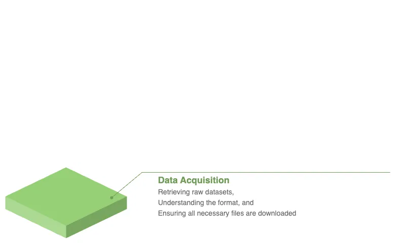
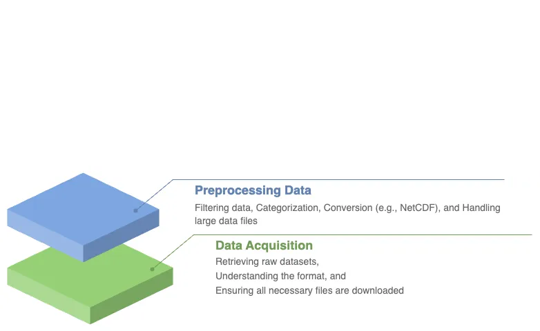
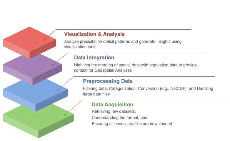
In this comprehensive lesson, you will embark on an immersive journey that combines advanced data acquisition, pre-processing, and exploration of vital water security data. Specifically, you will retrieve the Water Security Indicator Model - Global Land Data Assimilation System (WSIM-GLDAS) dataset, available from NASA’s Socioeconomic Data and Applications Center (SEDAC). This dataset provides crucial insights into water anomalies, such as droughts and floods, and will serve as the foundation for your analysis.
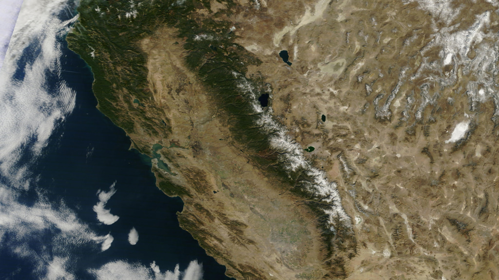
This true color satellite image of California illustrates regions experiencing water stress such as droughts. Visual representations like this are essential for understanding the spatial distribution of water security risks and guiding decision-making processes to manage limited freshwater resources. [11]
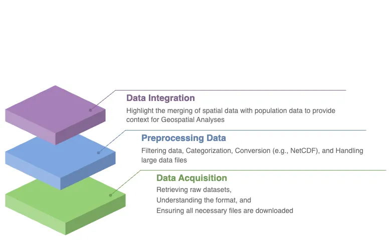
As you progress through this lesson, you will be guided step by step through several pre-processing tasks designed to help you make sense of this complex data. You will learn not only how to handle and subset the WSIM-GLDAS dataset but also how to enhance its value by integrating it with other globally recognized datasets. In particular, you will incorporate the geoBoundaries dataset, which offers global administrative boundary data, and the Gridded Population of the World dataset, a vital resource for understanding how human populations are affected by water anomalies.
Through the lesson, you’ll engage in a series of data manipulations and visualizations, gaining practical skills in handling large-scale geospatial data. These advanced visualizations will empower you to reveal patterns in precipitation deficits and surpluses, providing a clearer understanding of how water-related events impact specific regions. Ultimately, by the end of the lesson, you’ll have a complete workflow in place to retrieve, process, and visualize complex data, arming you with the tools to explore critical water security issues affecting communities around the globe.
Learning Objectives
By the end of this lesson, you will have developed a solid understanding of the technical and analytical skills needed to work with complex datasets in the field of water security. You will have gained the ability to:
Retrieve WSIM-GLDAS Data. Confidently access the WSIM-GLDAS dataset from the NASA SEDAC website, ensuring you can efficiently acquire the necessary data for analysis.
Access Administrative Boundaries. Use the geoBoundaries API to retrieve up-to-date global administrative boundary data, allowing you to contextualize the WSIM-GLDAS dataset within specific regional borders.
Subset WSIM-GLDAS Data. Learn how to filter and subset the WSIM-GLDAS data for specific regions and time periods, enabling you to focus on areas of particular interest in your analysis.
Visualize Geospatial Data. Create insightful geospatial visualizations that highlight patterns of precipitation deficits, helping you to communicate complex findings with clarity and precision.
Save Pre-Processed Data. Export your pre-processed NetCDF-formatted files to disk, giving you the ability to save and share your refined datasets for future use or collaboration.
Explore Data Visually. Master advanced data visualization techniques, including the creation of histograms, choropleths, and time series maps, to explore patterns and trends within the dataset.
Integrate Population Data. Combine the WSIM-GLDAS data with Gridded Population of the World data to analyze how water anomalies intersect with population distribution, providing valuable insights into the human impacts of water security issues.
Summarize Data with Zonal Statistics. Utilize zonal statistics to summarize the WSIM-GLDAS and population raster data, providing an analytical overview of how water shortages or surpluses affect specific regions and communities.
Through these objectives, you will not only gain proficiency in handling complex geospatial data but also develop a deeper understanding of how these datasets can be leveraged to solve real-world challenges, particularly in the realm of water security and population impacts.
Introduction
The Water cycle, also known as the Hydrologic cycle, refers to the continuous movement and circulation of water across, above, and below the Earth’s surface. It is a fundamental process that sustains life, ensuring that water is recycled and made available through precipitation, evaporation, and condensation (NOAA, 2019 [1]). However, human activities in recent decades — such as the emission of greenhouse gases, land-use alterations, the construction of dams and reservoirs, and the extraction of groundwater — have increasingly disrupted the natural flow of this cycle (IPCC, 2023 [2]). These anthropogenic influences have had significant and far-reaching consequences on various processes tied to oceans, groundwater systems, and land surfaces. As a result, extreme events like droughts and floods are becoming more frequent and intense (Zhou, 2016 [3]).
Drought, which occurs when precipitation deficits persist over time, is characterized by prolonged dry periods that lead to severe water shortages. The cascading effects of drought are felt across ecosystems, agriculture, and human communities, often creating feedback loops that exacerbate environmental stresses (Rodgers, 2023 [4]). For instance, California is notorious for recurrent droughts, but prolonged dry spells, coupled with sustained high temperatures, severely reduced the replenishment of fresh water to key water bodies like the Klamath River. From 2003 to 2014, the state experienced extreme water shortages that had devastating effects. These shortages significantly impacted California’s Central Valley, a vital agricultural region responsible for producing 80% of the world’s almonds. The droughts also caused ecological distress by triggering declines in Chinook salmon populations, as the lack of fresh water led to heat stress and disease outbreaks among the fish, affecting the Klamath basin tribal groups, who rely heavily on these salmon for sustenance (Guillen, 2002 [5]; Bland, 2014 [6]).
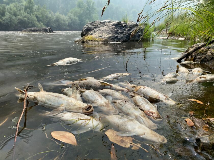
Indigenous Communities and Water Resources. The Klamath basin tribal groups depend on the Chinook salmon for their livelihood, but water shortages and environmental stress have led to a significant decline in salmon populations. [10]
To better understand and quantify such changes in water availability and their implications, datasets like the Water Security (WSIM-GLDAS) Monthly Grids, v1 (1948 - 2014) are invaluable. This particular dataset offers detailed insights into freshwater surpluses and deficits across the globe, tracking them monthly over a 66-year period from January 1948 to December 2014 (ISciences & CIESIN-Columbia University, 2022b [7]).
The WSIM-GLDAS dataset organizes its data by thematic variables such as temperature, runoff, soil moisture, precipitation, and evapotranspiration, as well as temporal aggregation periods (e.g., 1-month, 3-month, 6-month, and 12-month intervals). This structure allows for comprehensive exploration of water-related anomalies across various timescales. The data files, stored in NetCDF (.nc) format, contain time-dimensioned raster layers, each representing one of the 804 months in the dataset. Some variables even contain multiple attributes with their own time series. It is important to note that because the dataset is vast and consists of multiple layers, downloading and handling the files can be resource-intensive, possibly leading to memory issues on some computers.
This dataset represents what is known as “Big Data”, requiring advanced tools and techniques to analyze and draw meaningful conclusions from. By working with this dataset, students and researchers will gain practical experience dealing with complex, large-scale data, while also exploring critical water security issues at a global level.
About the Data
For this lesson, we will work with the WSIM-GLDAS dataset focusing on the Composite Anomaly Twelve-Month Return Period NetCDF file. This file includes water deficit, surplus, and composite anomaly variables, each with a 12-month integration period. The integration period refers to the timeframe over which anomaly values are averaged. In this case, the 12-month integration averages water-related anomalies like droughts and floods over a year, providing a high-level overview of water deficits, surpluses, and combined anomalies. This helps in understanding yearly trends, and once we’ve identified key time periods of interest, we can refine our analysis using the 3-months or 1-month integration periods.
We’ll start by downloading the file directly from the SEDAC website. The dataset documentation highlights the composite variables as essential elements of WSIM-GLDAS, which integrate the return periods of multiple water-related parameters into composite indices of overall water surpluses and deficits (ISciences & CIESIN-Columbia University, 2022a [7]). These composite anomaly files provide data in terms of return periods, indicating how often anomalies such as droughts or floods occur. For example, a deficit return period of 25 suggests a drought so severe that it would only occur once every 25 years.
Downloading the Dataset
Visit the SEDAC website.
You can navigate through themes, datasets, or collections on the platform. For this exercise, use the search bar to look up “wsim.”
Locate and select the Water Security (WSIM-GLDAS) Monthly Grids, v1 (1948-2014) dataset.
When you’re ready, go to the Data Download tab. You’ll need to sign in using your NASA EarthData account. Learn more
Once logged in, find the Composite Class and select the Variable Composite Anomaly Twelve-Month Return Period for download.
Loading the Dataset
…
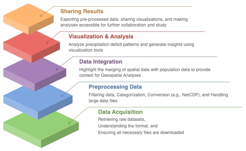
After downloading the WSIM-GLDAS file to your local machine, the next step is to prepare your Python environment by installing and loading the necessary packages. This is an essential part of ensuring your system is ready to handle the data processing efficiently. This installation process makes it easier to manage dependencies.
python3 -m pip install \
    exactextract \
    geopandas \
    numpy \
    pandas \
    plotnine \
    rasterio \
    requests \
    rioxarray \
    xarray
Once the packages are installed and you have the
composite_anom_12mo.nc file in your working directory, it’s time to
begin reading the file. We will be using
xarray, let’s start by importing it.
import folium
import geopandas as gpd
import matplotlib.pyplot as plt
import pandas as pd
import requests
import xarray as xr
The below code is configuring xarray options
and IPython display settings to control the
behavior of data representation and plotting in Jupyter notebooks.
xr.set_options(
    keep_attrs=True,
    display_expand_attrs=False,
    display_expand_coords=False,
    display_expand_data=False,
    display_expand_data_vars=False
)
%config InlineBackend.figure_format="retina"
small: int = 6
medium: int = 10
large: int = 14
params = {
    "axes.labelsize": medium,
    "axes.spines.right": False
    "axes.spines.top": False
    "axes.titlesize": medium,
    "axes.titlesize": medium,
    "figure.figsize": (16, 10),
    "figure.titlesize": large,
    "image.interpolation": "nearest",
    "image.origin": "lower",
    "legend.fontsize": medium,
    "xtick.labelsize": medium,
    "ytick.labelsize": medium,
}
plt.rcParams.update(params)
plt.style.use("seaborn-v0_8-whitegrid")
Code Explanation
-
This
classused to set global options that affect the behavior ofxarrayoperations. Here’s what each option does:keep_attrs=True.This ensures that metadata are preserved when performing operations onxarrayobjects. By default, manyxarrayoperations drop attributes, but setting this toTrueprevents that.display_expand_attrs=False.This controls the display of attributes in thexarrayobject’s representation. Setting this toFalsekeeps the attribute section collapsed when printing anxarrayobject.display_expand_coords=False.This option controls whether coordinate variables are expanded (shown in detail) when displaying anxarrayobject. Setting it toFalsecollapses the coordinate details.display_expand_data=False.Similar to the previous options, this collapses the data section of thexarrayobject when printing. This can make the display of large datasets more manageable.display_expand_data_vars=False.This option collapses the display of data variables in the output of anxarraydataset, keeping it neater for large datasets.
Tip
These options help manage how xarray data structures are
displayed in Jupyter notebooks, making them more concise by
collapsing various sections (attributes, coordinates, data, and
data variables).
%config InlineBackend.figure_format=”retina”
This is an IPython magic command that configures the way figures (like plots) are displayed in Jupyter notebooks. This sets the figure resolution to “retina,” which produces high-resolution plots for better visual quality, especially on displays with high pixel density (like MacBooks with Retina displays). This is commonly used in Jupyter notebooks to make plots look crisper.
Using the xarray.open_dataset() function, read
the file and print the dataset.
# Load the WSIM-GLDAS dataset (12-month composite netCDF file)
wsim_gldas = xr.open_dataset("composite_12mo.nc", engine="netcdf4")
wsim_gldas
<xarray.Dataset> Size: 14GB
Dimensions:                       (lon: 1440, lat: 600, time: 793)
Coordinates: (3)
Data variables: (7)
Attributes: (5)
The output reveals that the dataset consists of five attributes: deficit,
deficit_cause, surplus, surplus_cause, and both (a combination
of surpluses and deficits. Additionally, it has three dimensions:
longitude and latitude (spatial extents on the x/y axes) and time
as the third dimension.
In total, this amounts to 4020 individual raster layers (calculated as 5 attributes multiplied by 804 time steps/months). This is a clear indication of just how extensive and complex the dataset is, and further reinforces the importance of efficient data handling.
Attribute Selection of Reducing Complexity
Now that we’ve loaded the dataset, let’s focus on reducing the size and
complexity of the data by selecting only the variables we need. This process is
known as Attribute Selection. In this example, we’ll focus on the
deficit variable, which represents drought conditions, and the crs
variable, which contains spatial reference information (i.e., coordinate
reference system).
Why leave out other variables? Well, this decision depends on the specific goals of your analysis. Since we already know that this dataset covers 12-months, we can safely omit the integration variable, which tracks the time period.
…
# Subset the dataset to include only the 'deficit' and 'crs' (coordinate reference system)
subset = wsim_gldas[["deficit", "crs"]]
subset
<xarray.Dataset> Size: 3GB
Dimensions:  (time: 793, lat: 600, lon: 1440)
Coordinates: (3)
Data variables: (2)
Attributes: (5)
In this code block, we use double brackets to subset the dataset and
extract only the variables we’re interested in — deficit
and crs. This step is crucial for efficiently managing memory when
working with large datasets. By reducing the number of variables, we
make the data easier to handle, especially if you’re performing
intensive operations later on.
After subsetting the data, it’s always a good practice to inspect the
result to make sure everything looks as expected. When you print
wsim_gldas again, you should see that the dataset now contains only
two variables: deficit and crs. This reduction in variables
helps streamline the dataset and ensures that we’re only working with
the most relevant information.
By focusing on deficit, which is vital for understanding drought conditions, and retaining the crs information for spatial analysis, we can move forward confidently, knowing that we’ve optimized the dataset for our needs.
This step-by-step guide not only reduces the dataset to a more manageable size but also maintains the critical information needed for your analysis. The goal here is to simplify the workflow while ensuring you have everything required to proceed.
Time Selection for Improved Data Efficiency
In this section, we’ll delve into how to further refine the dataset by selecting a specific time range that aligns with your analysis goals. Narrowing down the temporal range helps reduce the overall size of the dataset, making it more manageable and focused. This process will also allow us to focus on key moments in the data, which is essential when analyzing time-series datasets.
Why Focus on a Specific Temporal Range?
Large datasets often contain data spanning many years, and while this can be beneficial for certain analyses, it can also make the file unnecessarily large and difficult to work with. By specifying a temporal range of interest, we can isolate the most relevant portions of the dataset. In this case, we’re interested in the period from December 2000 to December 2014, and by selecting data from these years, we make the file smaller and more manageable.
The dataset we’re using, WSIM-GLDAS, aggregates the deficit (drought)
variable over a 12-month period. This means that each time step in the dataset
represents an average of the deficit over the previous 12 months. As a result,
if we focus on the December months, we’ll obtain annual averages for the
deficit, which provides a clear picture of how drought conditions evolved year
by year.
Let’s dive into the step-by-step process for selecting this time range.
…
To start, we need to create a list of dates corresponding to every December between 2000 and 2014. This will ensure that we’re selecting a yearly snapshot of the drought deficit during this period. We’ll achieve this using the powerful Pandas library, which is excellent for handling time series data.
# Generate a list of dates for December of each year from 2000 to 2014
december_dates = pd.date_range(start="2000-12-01", end="2014-12-01", freq="YS-DEC")
# Subset the dataset to include only these December dates and
# plot the 'deficit' variable across the selected time steps
december_subset = subset.sel(time=december_dates)
december_subset.time
<xarray.DataArray 'time' (time: 15)> Size: 120B
2000-12-01 2001-12-01 2002-12-01 2003-12-01 ... 2012-12-01 2013-12-01 2014-12-01
Coordinates: (1)
Now that we’ve generated the sequence of dates, the next step is to
apply this list to the dataset and select only the data for the
specified months. This is where we use
xarray.DataArray.sel() method to subset the
dataset. By passing the list of dates, keeps, into the
xarray.DataArray.sel() method, we’re telling
xarray to extract only the data for the
corresponding time steps. This reduces the time dimension of the
dataset to 15 time steps — one for each December from
2000 to 2014. This step is crucial in reducing the overall size
of the dataset while ensuring we retain the annual averages for the
deficit variable.
At this point, we’ve successfully reduced the dataset to focus on the
deficit variable over the desired time range (2000-2014). Now that we
have a more manageable dataset, it’s often helpful to visualize the
data. Visualizations can give you a clearer understanding of patterns
and trends, especially when dealing with time-series data related to
spatial variables like deficit.
We’ll use Xarray’s built-in plotting functionality to create a quick visualization of the deficit over time.
december_subset.deficit.plot(
    col="time",
    col_wrap=3,
    cmap="Reds_r",
    aspect=2,
    size=2,
    cbar_kwargs={
        "orientation": "vertical",
        "shrink": 0.5,
        "label": "Deficit Anomaly"
    }
)
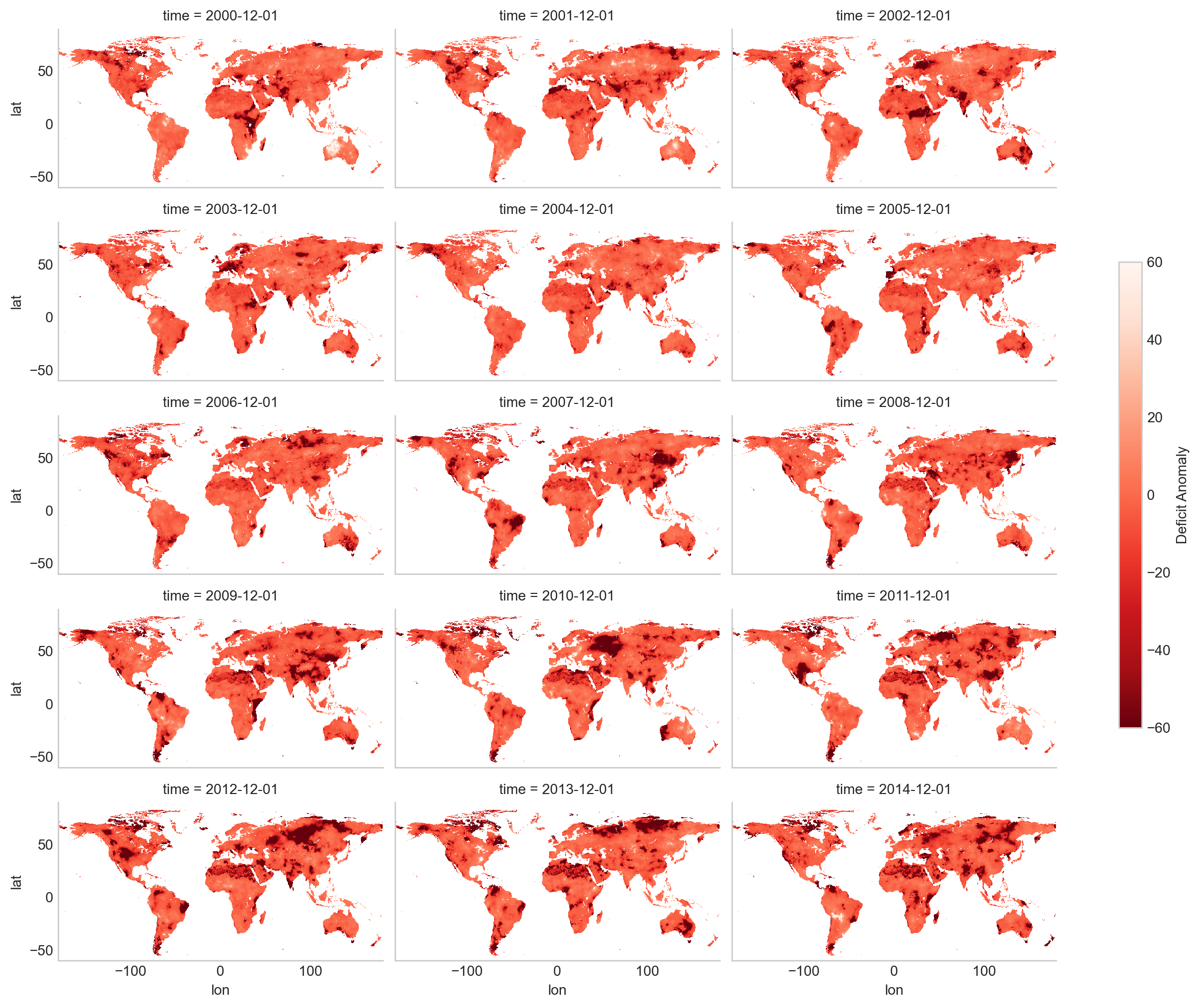
Although we’ve already reduced the dataset significantly by focusing on a single variable and a specific time range, there may still be situations where you want to narrow it down even further. For example, you might only be interested in analyzing a particular geographic region, such as a country or a state. By limiting the spatial extent, you can make the dataset even smaller and more targeted to your specific area of interest.
In future steps, we’ll explore how to subset the dataset spatially, allowing you to focus on the regions that matter most for your analysis.
By specifying a temporal range and visualizing the deficit data, we’ve taken important steps to optimize the dataset for analysis. This approach not only reduces the size of the file, making it easier to handle, but also ensures that we’re focusing on the most relevant time period. In the next steps, we can explore how to further refine the dataset by limiting the spatial extent to specific regions.
Spatial Selection of a Geographic Area of Interest
In data analysis, especially when working with spatial datasets, we often need to focus on a specific geographic region. Whether it’s for better performance, easier data handling, or simply because you’re interested in a particular area, spatial selection is an essential tool.
In this case, we’ll be cropping our dataset, WSIM-GLDAS, to a specific geographic region using the boundary of the United States and further refining it to just Texas. This reduces the amount of data we’re working with, making it smaller, easier to manage, and more focused for analysis.
Methods for Cropping Spatial Data
Bounding Box. This method uses specific geographic coordinates (longitude and latitude) that define the extent of the area you wish to select. Example: You provide the xmin, ymin, xmax, and ymax coordinates to specify the rectangular area you want to crop.
Raster Object. You can also use another raster dataset to crop your target dataset by matching its extent to that of the provided raster.
Vector Boundary. Another common method is to crop the dataset using a vector boundary — a shapefile or GeoJSON that defines a geographic or political boundary (e.g., country, state, province).
In this example, we will use a vector boundary in GeoJSON format to crop our raster data. This method is particularly useful when working with well-defined areas like states or countries.
To begin, we need to obtain a vector boundary that represents the geographic area we are interested in. We will use the geoBoundaries API to fetch this data. The geoBoundaries API allows us to access vector boundaries for countries and their subdivisions, such as states or provinces. This data can be retrieved in various formats, including GeoJSON, which is a widely used format for geographic data.
For this example, we’ll be working with the United States and specifically focusing on Administrative Level 1 (ADM1), which corresponds to the State level.
The API URL structure is as follows: https://www.geoboundaries.org/api/current/gbOpen/ISO3/LEVEL/
ISO3. This is the three-letter country code (for the U.S., it’s “USA”).
LEVEL. This defines the administrative level (in this case, “ADM1” for states).
Why Focus on a Specific Temporal Range?
Large datasets often contain data spanning many years, and while this can be beneficial for certain analyses, it can also make the file unnecessarily large and difficult to work with. By specifying a temporal range of interest, we can isolate the most relevant portions of the dataset. In this case, we’re interested in the period from December 2000 to December 2014, and by selecting data from these years, we make the file smaller and more manageable.
The dataset we’re using, WSIM-GLDAS, aggregates the deficit (drought)
variable over a 12-month period. This means that each time step in the dataset
represents an average of the deficit over the previous 12 months. As a result,
if we focus on the December months, we’ll obtain annual averages for the
deficit, which provides a clear picture of how drought conditions evolved year
by year.
Let’s dive into the step-by-step process for selecting this time range.
…
We’ll use the requests library to access this data and the geopandas library to handle the GeoJSON file.
us_boundaries = requests.get(
    "https://www.geoboundaries.org/api/current/gbOpen/USA/ADM1/"
)
us_boundaries = us_boundaries.json()
The JSON response from the geoBoundaries API contains a variety of information, but what we need is the direct link to the GeoJSON file. This link is found in the gjDownloadURL field (typically located in item 29 of the response).
We’ll now use geopandas to load and visualize the GeoJSON data.
us_boundaries = gpd.read_file(us_boundaries["gjDownloadURL"])
us_boundaries = us_boundaries.rename(columns=lambda x: x.replace("shape", "State "))
us_map = folium.Map([43, -100], tiles="cartodbpositron", zoom_start=5)
folium.GeoJson(
    us_boundaries,
    name="USA",
    zoom_on_click=True,
    marker=folium.Marker(icon=folium.Icon(icon="star")),
    tooltip=folium.GeoJsonTooltip(fields=["State Name"]),
    popup=folium.GeoJsonPopup(fields=["State Name"]),
    style_function=lambda x: {
        "fillColor": "red",
        "color": "red",
        "weight": 1,
    }
).add_to(us_map)
us_map
The GeoJSON we retrieved contains the boundaries for all U.S. states and territories, including places like Alaska, Hawaii, and Puerto Rico. For this demonstration, we’re going to focus on the contiguous United States (i.e., the 48 mainland states), so we’ll need to exclude certain regions from our dataset.
# Exclude territories and states outside of the contiguous USA (CONUS)
excluded_areas = [
    "Alaska",
    "Hawaii",
    "American Samoa",
    "Puerto Rico",
    "Guam",
    "Northern Mariana Islands",
    "United States Virgin Islands",
]
# Keep only the continental USA boundaries
contiguous_us_boundaries = us_boundaries[~us_boundaries["State Name"].isin(excluded_areas)]
# Plot the contiguous US boundaries for a clearer visual
folium.GeoJson(
    contiguous_us_boundaries,
    zoom_on_click=True,
    marker=folium.Marker(icon=folium.Icon(icon="star")),
    tooltip=folium.GeoJsonTooltip(fields=["State Name"]),
    popup=folium.GeoJsonPopup(fields=["State Name"]),
    style_function=lambda x: {
        "fillColor": "orange",
        "color": "orange",
        "weight": 1,
    }
).add_to(us_map)
us_map
For more detailed analysis, we might want to focus on a specific state. In this example, let’s focus on Texas.
# Extract and visualize the boundary for a specific state (e.g., Texas)
texas_boundary = contiguous_us_boundaries[contiguous_us_boundaries["State Name"].str.contains("Texas")]
This snippet extracts Texas by filtering the shapeName column for any entries that contain the word “Texas”. We can then visualize just the Texas boundary.
# Plot Texas boundary for a clearer visual
folium.GeoJson(
    texas_boundary,
    name="Texas",
    zoom_on_click=True,
    tooltip=folium.GeoJsonTooltip(fields=["State Name"]),
    popup=folium.GeoJsonPopup(fields=["State Name"]),
    style_function=lambda x: {
        "fillColor": "green",
        "color": "green",
        "weight": 1,
    }
).add_to(us_map)
us_map
Now that we have the vector boundary for Texas, we can use it to crop the WSIM-GLDAS dataset. This process is called spatial clipping, where the raster data is cropped to the extent of the Texas boundary. For this, we’ll use rioxarray, a library built on top of Xarray and Rasterio that provides geospatial raster operations.
First, we need to ensure the dataset has the correct Coordinate Reference System (CRS), which we can set to EPSG: 4326, a common geographic coordinate system.
december_subset = december_subset.rio.write_crs("EPSG:4326")
Now that we’ve successfully clipped the dataset to the extent of Texas, we can visualize the results. We’ll plot the last time step in the dataset (December 2014) and overlay it with the Texas boundary to verify our processing.
wsim_gldas_texas = december_subset.rio.clip(texas_boundary.geometry.values)
wsim_gldas_texas.deficit.plot(
    col="time",
    col_wrap=3,
    cmap="Reds_r",
    aspect=0.75,
    size=3,
    cbar_kwargs={
        "orientation": "horizontal",
        "shrink": 0.5,
        "label": "Deficit Anomaly"
    }
)
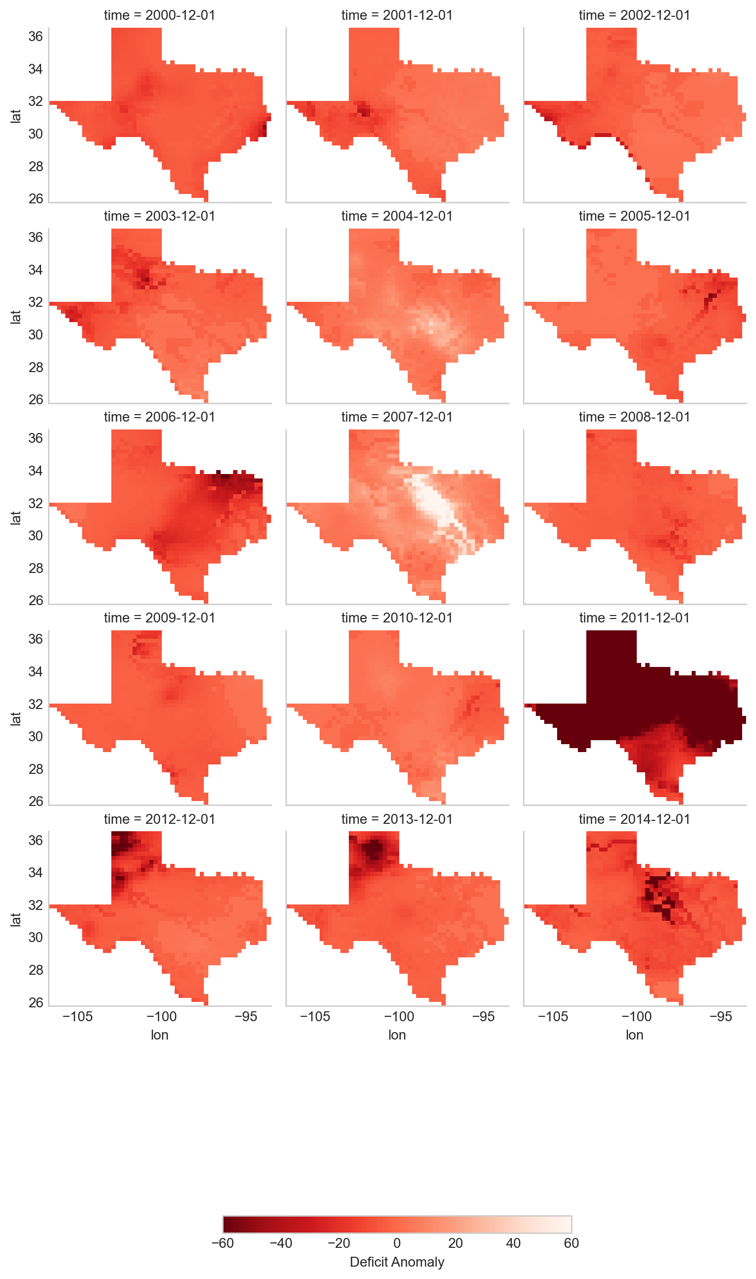
This plot provides a clear view of the deficit anomaly within Texas over time, with color variations showing the severity of drought conditions.
Finally, we can save both the processed raster data (WSIM-GLDAS) and the vector boundary (Texas) to disk. This is useful for sharing with colleagues, conducting further analysis, or storing the data for future use.
wsim_gldas_texas.to_netcdf("wsim_gldas_texas.nc")
texas_boundary.to_file("texas_boundary.geojson")
The resulting dataset is significantly smaller (1.6 MB compared to the original 1.7 GB), making it much more manageable for further analysis, especially in cloud environments or workshops.
This completes the process of spatially selecting and processing your data, allowing you to focus on the region and variable of interest.
Advanced Visualizations and Data Integrations
Now that we’ve introduced the basics of manipulating and visualizing WSIM-GLDAS, we can explore more advanced visualizations and data integrations. Let’s clear the workspace and start over again with the same WSIM-GLDAS Composite Anomaly Twelve-Month Return Period we used earlier. We will spatially subset the data to cover only the Continental United States (CONUSA) which will help to minimize our memory footprint. We can further reduce our memory overhead by reading in just the variable we want to analyze. In this instance we can read in just the deficit attribute from the WSIM-GLDAS Composite Anomaly Twelve-Month Return Period file, rather than reading the entire NetCDF with all of its attributes.
For this exercise, we can quickly walk through similar pre-processing steps we performed earlier in this lesson and then move on to more advanced visualizations and integrations. Read the original 12-month integration data back in, filter with a list of dates for each December spanning 2000-2014, and then crop the raster data with the boundary of the contiguous United States using our geoBoundaries object.
…
wsim_gldas = xr.open_dataset("composite_12mo.nc, engine = "h5netcdf")

# list of dates we want to keep
keeps = pd.date_range(start="2000-12-01", end="2014-12-01", freq = "YS-DEC")

# subset for the dates
wsim_gldas = wsim_gldas.sel(time=keeps)

# subset for the variable of interest and the crs info
wsim_gldas = wsim_gldas[["deficit", "crs"]]

# give the time variable pretty names
wsim_gldas = wsim_gldas.assign_coords(time=list(range(2000, 2015)))

# clip wsim_gldas
wsim_gldas = wsim_gldas.rio.write_crs("epsg: 4326")
wsim_gldas = wsim_gldas.rio.clip(usa.geometry.values)
Double check the object information.
# check the basic information again
wsim_gldas
You will want to review the printout to make sure it looks okay.
Does it contain the variables you were expecting?
Do the values for the variables seem plausible?
Other basic descriptive analyses are useful to verify and understand your data. One of these is to produce a frequency distribution (also known as a histogram), which is reviewed below.
Annual CONUSA Time Series
The basic data properties reviewed in the previous step are useful for exploratory data analysis, but we should perform further inspection. We can start our visual exploration of annual drought in the CONUSA by creating a map illustrating the deficit return period for each of the years in the WSIM-GLDAS object.
…
# check visuals
wsim_gldas.deficit.plot(
    x="lon",
    y="lat",
    col="time",
    col_wrap=3,
    cmap="Reds_r",
    aspect=1,
    size=2,
    vmin=-60,
    vmax=0,
    cbar_kwargs={
        "orientation":"horizontal",
        "shrink":0.6,
        "label":"Deficit Anomaly"
    }
)
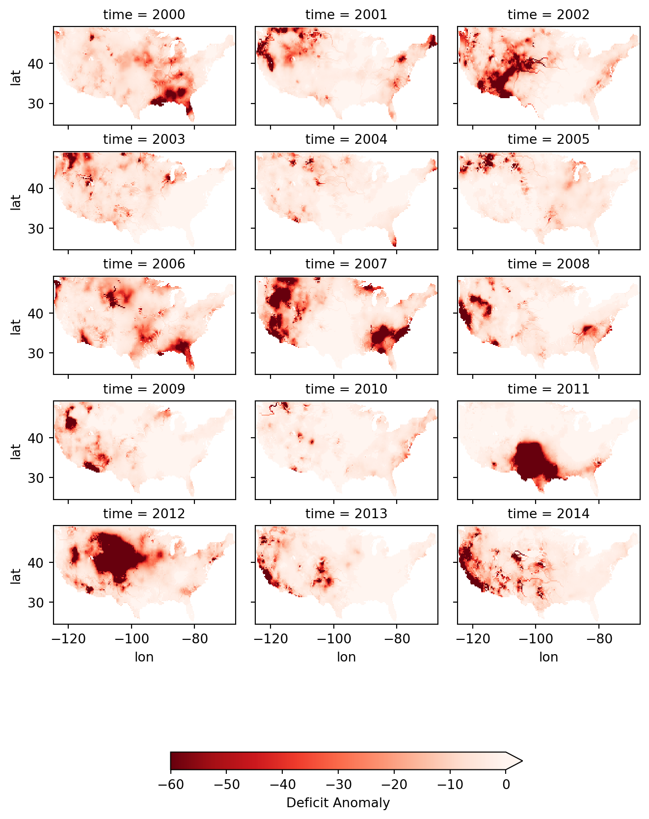
This visualization shows that there were several significant drought events (as indicated by dark red deficit return-period values) throughout 2000-2014. Significant drought events included the southeast in 2000, the southwest in 2002, the majority of the western 3rd in 2007, Texas-Oklahoma in 2011, Montana-Wyoming-Colorado in 2012, and the entirety of the California coast in 2014. The droughts of 2012 and 2011 are particularly severe and widespread with return periods greater than 50 years covering multiple states. Based on historical norms, we should only expect droughts this strong every 50-60 years!
Monthly Time Series
We can get a more detailed look at these drought events by using the 1-month composite WSIM-GLDAS dataset and cropping the data to a smaller spatial extent matching one of the events we’ve noted in the previous plot. Let’s take a closer look at the 2014 California drought.
…
In order to limit the amount of computing memory required for the operation, we will first clear items from the in-memory workspace and then reload a smaller composite file, we’ll start by removing the 12-month composite object.
# remove the large wsim object from the environment
del wsim_gldas
Now let’s load the composite 1-month file from SEDAC into the workspace. The attributes and dimensions will be the same as the 12-month integration so we’ll skip ahead to directly loading in the deficit variable without performing a check on the structure using proxy = TRUE.
wsim_gldas_1mo = xr.open_dataset("composite_1mo.nc", engine = "h5netcdf")
wsim_gldas_1mo
<xarray.Dataset> Size: 14GB
Dimensions:                       (lon: 1440, lat: 600, time: 804)
Coordinates: (3)
Data variables: (7)
Attributes: (5)
keeps = pd.date_range(start="2014-01-01", end="2014-12-01", freq = "MS")
wsim_gldas_1mo = wsim_gldas_1mo.sel(time= keeps)
wsim_gldas_1mo = wsim_gldas_1mo[["deficit", "crs"]]
wsim_gldas_1mo
<xarray.Dataset> Size: 41MB
Dimensions:  (time: 12, lat: 600, lon: 1440)
Coordinates: (3)
Data variables: (2)
Attributes: (5)
Now we have 12 rasters with monthly data for 2014. Let’s zoom in on California and see how this drought progressed over the course of the year.
# isolate only the california border
california = contiguous_us_boundaries[
    contiguous_us_boundaries["State Name"]
    .str
    .contains("California")
]
wsim_gldas_1mo = wsim_gldas_1mo.rio.write_crs("epsg: 4326")
wsim_gldas_california = wsim_gldas_1mo.rio.clip(california.geometry.values)

# give the time dimension pretty labels
wsim_gldas_california = wsim_gldas_california.assign_coords(
    time=list(calendar.month_name[1:])
)

# plot it
wsim_gldas_california.deficit.plot(
    x="lon",
    y="lat",
    col="time",
    col_wrap = 3,
    cmap = "Reds_r",
    aspect = 0.9,
    size =2.5,
    vmin = -60,
    vmax = 0,
    cbar_kwargs =  {
        "orientation": "vertical",
        "shrink": 0.6,
        "label":"Deficit Anomaly"
    }
)
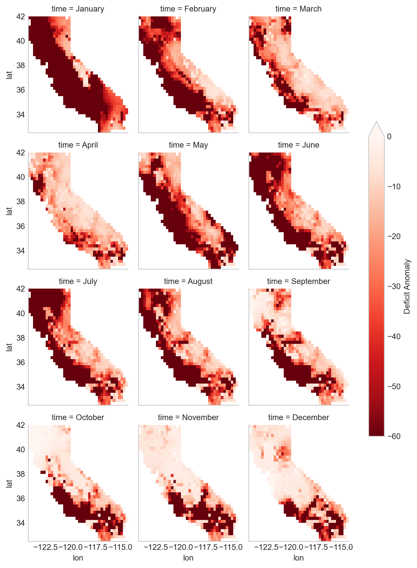
This series of maps shows a startling picture. California faced massive water deficits throughout the state in January and February. This was followed by water deficits in the western half of the state in May-August. Although northern and eastern California saw some relief by September, southwest California continued to see deficits through December.
Zonal Summaries
To this point we’ve described the 2014 California drought by examining the state as a whole. Although we have a sense of what’s happening in different cities or counties by looking at the maps, they do not provide quantitative summaries of local areas.
Zonal statistics are one way to summarize the cells of a raster layer that lie within the boundary of another data layer (which may be in either raster or vector format). For example, aggregating deficit return periods with another raster depicting land cover type or a vector boundary (shapefile) of countries, states, or counties, will produce descriptive statistics by that new layer. These statistics could include the sum, mean, median, standard deviation, and range.
For this section, we begin by calculating the mean deficit return period within California counties. First, we retrieve a vector dataset of California counties from the geoBoundaries API. Since geoBoundaries does not attribute which counties belong to which states, we utilize a spatial operation called intersect to select only those counties in California.
…
usa_counties = requests.get(
    "https://www.geoboundaries.org/api/current/gbOpen/USA/ADM2/"
)

# parse the request for the data
usa_counties = usa_counties.json()
usa_counties = gpd.read_file(usa_counties["gjDownloadURL"])

# intersect california state level with usa counties

california_counties = usa_counties.overlay(california, how="intersection")
california_counties.plot()
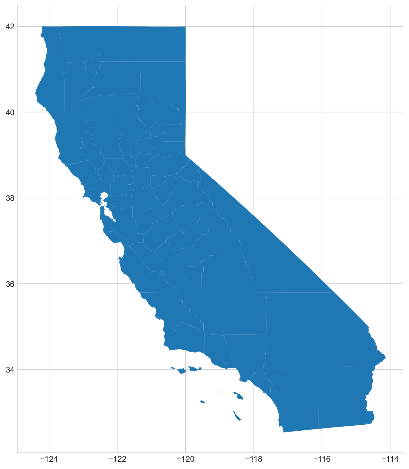
The output of that intersection looks as expected. As noted above, in general a visual and/or tabular check on your data layers is always a good idea. If you expect 50 counties in a given state, you should see 50 counties resulting from your intersection of your two layers, etc. You may want to be on the look out for too few (such as an island area that may be in one layer but not the other) or too many counties (such as those that intersect with a neighboring state).
We will perform our zonal statistics using the exactextractr package (Daniel Baston 2023). It is the fastest, most accurate, and most flexible zonal statistics tool for the R programming language.
Now let’s carry out the extraction and check the January output.
from exactextract import exact_extract

# run the extraction
cc_summaries = exact_extract(
    wsim_gldas_california.deficit,
    california_counties,
    "mean",
    output="pandas",
    include_cols="shapeName",
    include_geom=True
)

# make the column names pretty
col_names = [["county"], calendar.month_name[1:], ["geometry"]]
col_names = sum(col_names, [])
cc_summaries.columns = col_names
exactextractr returns summary statistics in the same order of the input boundary file, therefore we can join the California county names to the exactextract summary statistics output for visualization. We can take a quick look at the first 10 counties to see their mean deficit return period for January-June.
# check first 10 rows
cc_summaries[0:10]
| county | January | February | March | April | May | June | July | August | September | October | November | December | geometry | |
|---|---|---|---|---|---|---|---|---|---|---|---|---|---|---|
| 0 | Alpine | -41.762840 | -16.325728 | -13.645101 | -8.343272 | -28.199846 | -29.179775 | -25.325485 | -14.808689 | -14.582643 | -4.376792 | -4.113872 | -5.714340 | POLYGON ((-119.57953 38.70561, -119.59866 38.6... |
| 1 | Mohave | -41.926029 | -7.661513 | -9.152430 | -14.206533 | -60.000000 | -10.475436 | -6.967257 | -7.795761 | -2.742674 | -4.661378 | -6.620070 | -11.090995 | MULTIPOLYGON (((-114.48678 34.71911, -114.4860... |
| 2 | Tuolumne | -46.240213 | -19.108027 | -16.389606 | -8.347591 | -42.286756 | -24.053486 | -22.873270 | -26.276834 | -29.332736 | -5.976634 | -3.198179 | -2.996842 | POLYGON ((-119.88476 38.35619, -119.86968 38.3... |
| 3 | Tehama | -57.917277 | -49.567668 | -23.608668 | -21.017951 | -28.339994 | -46.608842 | -42.693579 | -33.756402 | -8.716129 | -1.808360 | -7.166282 | -5.475178 | POLYGON ((-121.49789 40.43201, -121.47404 40.4... |
| 4 | Trinity | -59.978625 | -45.856119 | -45.540983 | -25.803624 | -43.663656 | -60.000000 | -60.000000 | -46.338076 | -2.438062 | 2.108574 | -6.474706 | -7.222751 | POLYGON ((-123.05144 40.26815, -123.01859 40.2... |
| 5 | Curry | -60.000000 | -56.224870 | -26.244996 | -4.247256 | -9.093711 | -54.969276 | -60.000000 | -60.000000 | -2.081964 | 2.505597 | -5.030906 | -5.104263 | MULTIPOLYGON (((-124.12621 41.997, -124.21162 ... |
| 6 | San Benito | -60.000000 | -60.000000 | -55.619817 | -23.027860 | -60.000000 | -60.000000 | -60.000000 | -59.993260 | -60.000000 | -59.984706 | -37.763730 | -4.135725 | POLYGON ((-121.62947 36.91169, -121.60737 36.8... |
| 7 | Josephine | -60.000000 | -22.464207 | -25.885935 | -14.265512 | -13.829797 | -32.273193 | -60.000000 | -43.312246 | -12.886647 | 1.938376 | -6.264188 | -8.443334 | MULTIPOLYGON (((-123.81401 41.9951, -123.82149... |
| 8 | Sierra | -19.329339 | -18.765692 | -11.403096 | -11.497562 | -18.052833 | -27.915046 | -27.949060 | -14.572026 | -6.030163 | -5.473642 | -1.692186 | -30.551402 | POLYGON ((-120.00937 39.44512, -120.03522 39.4... |
| 9 | El Dorado | -44.008753 | -17.298188 | -12.065714 | -9.303977 | -33.611919 | -28.847394 | -25.674937 | -12.958253 | -5.670928 | -6.029936 | -2.770664 | -10.949467 | POLYGON ((-119.90433 38.93333, -119.88766 38.9... |
As we expected after seeing the raw WSIM-GLDAS raster, there are significant widespread deficits. We can get a better visual by constructing a choropleth using the county vector boundaries.
County Choropleths
Now that we’ve inspected the raw data we can make a choropleth out of the mean deficit return period data
…
import matplotlib.pyplot as plt

# setup the panels for the figures
fig, axs = plt.subplots(
    4, 3, figsize=(8, 8), facecolor="w", sharex=True, sharey=True
)

# convert list of 2D axis positions into a 1d list of number 1-12
axs = axs.ravel()
fig.tight_layout()
fig.suptitle("Monthly California Deficits for 2014", fontsize=14, y=1.05)

# loop through columns to make the plot for each month
for i, month in enumerate(cc_summaries.columns[1:13]):
    axs[i].set_title(month, fontsize= 11)
    cc_summaries.plot(column=month, ax=axs[i], cmap = "Reds_r")
    california_counties.plot(
        ax=axs[i], edgecolor="black", color="none", linewidth=0.25
    )

# loop through again and turn off the axes for a cleaner map
for ax in axs:
    ax.axis("off")

patch_col = axs[0].collections[0]
cb = fig.colorbar(patch_col, ax=axs, shrink=0.5, label = "Deficit Anomaly")
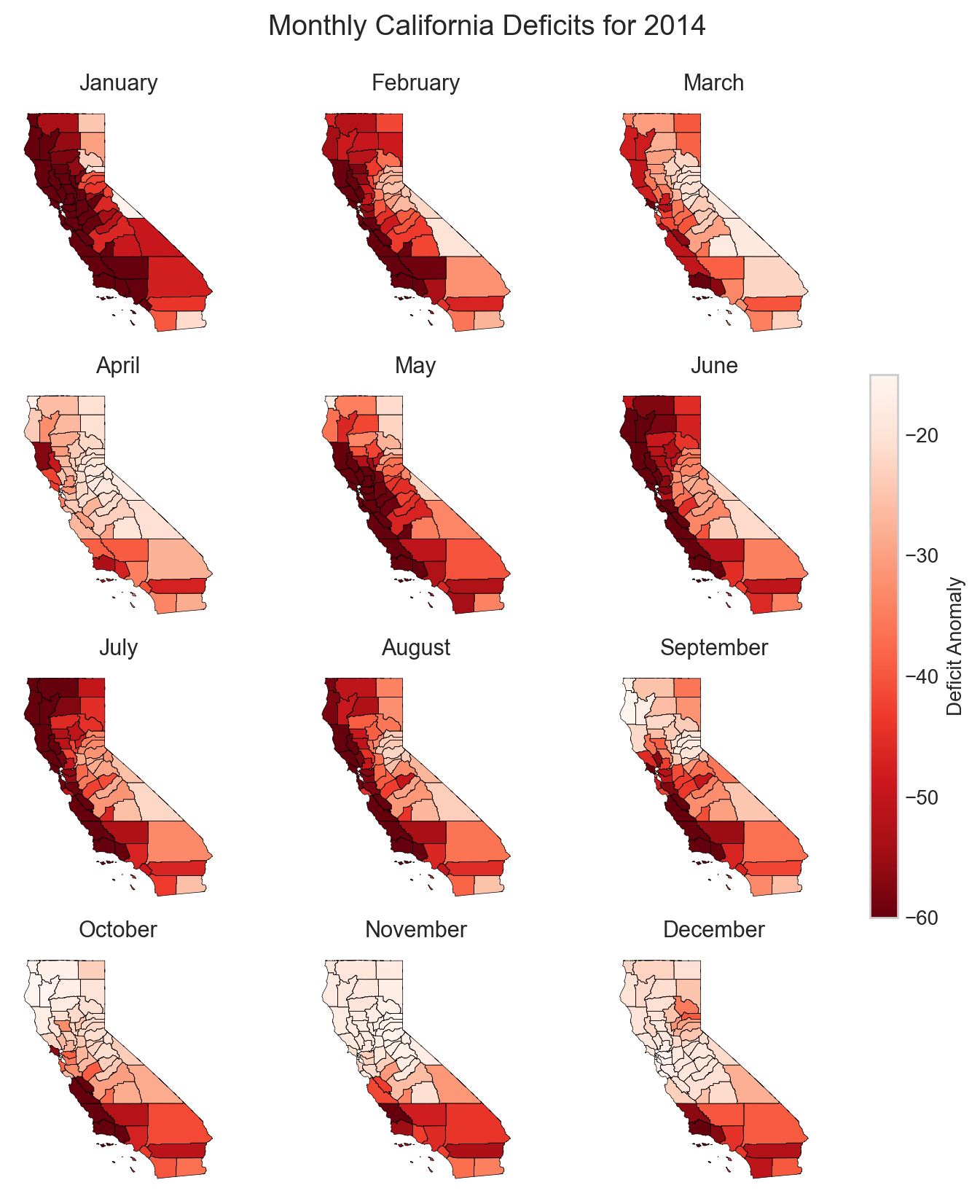
Due to the widespread water deficits in the raw data, the mean values do not appear much different from the raw deficit raster layer, however, choropleth maps, also called thematic maps, can make it easier for users to survey the landscape by visualizing familiar places (like counties) that place themselves and their lived experiences alongside the data.
While this paints a striking picture of widespread water deficits, how many people are affected by this drought? Although the land area appears rather large, if one is not familiar with the distribution of population and urban centers in California it can be difficult to get a sense of the direct human impact. (This is partly because more populous locations are usually represented by smaller land areas and the less populous locations are usually represented by large administrative boundaries containing much more land area). Normalizing a given theme by land area may be something an analyst wants to do but we cover another approach below.
Integrating Population Data
Gridded Population of the World (GPW) is a data collection from SEDAC that models the distribution of the global human population as counts and densities in a raster format (Center For International Earth Science Information Network-CIESIN-Columbia University 2018).We will take full advantage of exactextractr to integrate across WSIM-GLDAS, geoBoundaries, and GPW. To begin, we need to download the 15-minute resolution (roughly 30 square kilometer at the equator) population density data for the year 2015 from GPW. This version of GPW most closely matches our time period (2014) and the resolution of WSIM-GLDAS (0.25 degrees). Although in many applications one might choose to use GPW’s population count data layers, because we are using exactextractr we can achieve more accurate results (especially along coastlines) by using population density in conjunction with land area estimates from the exactextractr package.
…
Load in the population count layer.
# read in GPW with rioxarray
gpw = rio.open_rasterio("gpw_v4_population_count_rev11_2015_15_min.tif")
For this example we’ll classify the WSIM-GLDAS deficit return period raster layer into eight categories. Binning the data will make it easier to manage the output and interpret the results.
# list the class breaks
wsim_bins = [np.inf, 0, -3, -5, -10, -20, -40, -60, -np.inf]

# classify the wsim layer with the established breaks
wsim_class = xr.apply_ufunc(
    np.digitize,
    wsim_gldas_1mo,
    wsim_bins)
In our previous example, we used exactextractr’s built-in ‘mean’ function, but we can also pass custom functions to exactextractr that will carry out several operations at once as well. The following code could be combined into a single function passed to exactextractr, but it is presented here as multiple functions in order to follow along more easily. You can read more about exactextractr arguments on the package help guide. The key arguments to be aware of are the calls to:
[‘coverage’, ‘values’, ‘weights’]: These are the 3 operations we’re requesting be calculated. coverage calculates the corresponding area of the WSIM-GLDAS raster cell that is covered by the California boundary, values returns the value of the WSIM cell covered by the border, and weights returns the population count weight we supplied in the next argument.
weights = gpw: summarizes each WSIM-GLDAS cell’s deficit return period with the corresponding population count value.
# run the extraction
cal_wsim_gpw = exact_extract(
    wsim_class.deficit,
    california_counties,
    ["coverage", "values", "weights"],
    output="pandas",
    include_geom=False,
    weights=gpw
)
This returns a DataFrame with a row for every county in the california_counties layer we passed to exact_extract.
# check the first few rows
cal_wsim_gpw[:6]
| band_1_coverage | band_2_coverage | band_3_coverage | band_4_coverage | band_5_coverage | band_6_coverage | band_7_coverage | band_8_coverage | band_9_coverage | band_10_coverage | ... | band_3_weights | band_4_weights | band_5_weights | band_6_weights | band_7_weights | band_8_weights | band_9_weights | band_10_weights | band_11_weights | band_12_weights | |
|---|---|---|---|---|---|---|---|---|---|---|---|---|---|---|---|---|---|---|---|---|---|
| 0 | [5.243542545940727e-05, 0.363015353679657, 0.0... | [5.243542545940727e-05, 0.363015353679657, 0.0... | [5.243542545940727e-05, 0.363015353679657, 0.0... | [5.243542545940727e-05, 0.363015353679657, 0.0... | [5.243542545940727e-05, 0.363015353679657, 0.0... | [5.243542545940727e-05, 0.363015353679657, 0.0... | [5.243542545940727e-05, 0.363015353679657, 0.0... | [5.243542545940727e-05, 0.363015353679657, 0.0... | [5.243542545940727e-05, 0.363015353679657, 0.0... | [5.243542545940727e-05, 0.363015353679657, 0.0... | ... | [11718.642578125, 33362.7265625, 20356.484375,... | [11718.642578125, 33362.7265625, 20356.484375,... | [11718.642578125, 33362.7265625, 20356.484375,... | [11718.642578125, 33362.7265625, 20356.484375,... | [11718.642578125, 33362.7265625, 20356.484375,... | [11718.642578125, 33362.7265625, 20356.484375,... | [11718.642578125, 33362.7265625, 20356.484375,... | [11718.642578125, 33362.7265625, 20356.484375,... | [11718.642578125, 33362.7265625, 20356.484375,... | [11718.642578125, 33362.7265625, 20356.484375,... |
| 1 | [5.183805815156539e-11, 9.799367398954928e-05,... | [5.183805815156539e-11, 9.799367398954928e-05,... | [5.183805815156539e-11, 9.799367398954928e-05,... | [5.183805815156539e-11, 9.799367398954928e-05,... | [5.183805815156539e-11, 9.799367398954928e-05,... | [5.183805815156539e-11, 9.799367398954928e-05,... | [5.183805815156539e-11, 9.799367398954928e-05,... | [5.183805815156539e-11, 9.799367398954928e-05,... | [5.183805815156539e-11, 9.799367398954928e-05,... | [5.183805815156539e-11, 9.799367398954928e-05,... | ... | [19699.185546875, 21581.478515625, 41436.62109... | [19699.185546875, 21581.478515625, 41436.62109... | [19699.185546875, 21581.478515625, 41436.62109... | [19699.185546875, 21581.478515625, 41436.62109... | [19699.185546875, 21581.478515625, 41436.62109... | [19699.185546875, 21581.478515625, 41436.62109... | [19699.185546875, 21581.478515625, 41436.62109... | [19699.185546875, 21581.478515625, 41436.62109... | [19699.185546875, 21581.478515625, 41436.62109... | [19699.185546875, 21581.478515625, 41436.62109... |
| 2 | [0.01140472013503313, 0.5333179831504822, 0.55... | [0.01140472013503313, 0.5333179831504822, 0.55... | [0.01140472013503313, 0.5333179831504822, 0.55... | [0.01140472013503313, 0.5333179831504822, 0.55... | [0.01140472013503313, 0.5333179831504822, 0.55... | [0.01140472013503313, 0.5333179831504822, 0.55... | [0.01140472013503313, 0.5333179831504822, 0.55... | [0.01140472013503313, 0.5333179831504822, 0.55... | [0.01140472013503313, 0.5333179831504822, 0.55... | [0.01140472013503313, 0.5333179831504822, 0.55... | ... | [3108.652587890625, 218.21519470214844, 2.9919... | [3108.652587890625, 218.21519470214844, 2.9919... | [3108.652587890625, 218.21519470214844, 2.9919... | [3108.652587890625, 218.21519470214844, 2.9919... | [3108.652587890625, 218.21519470214844, 2.9919... | [3108.652587890625, 218.21519470214844, 2.9919... | [3108.652587890625, 218.21519470214844, 2.9919... | [3108.652587890625, 218.21519470214844, 2.9919... | [3108.652587890625, 218.21519470214844, 2.9919... | [3108.652587890625, 218.21519470214844, 2.9919... |
| 3 | [0.03276188299059868, 0.33793187141418457, 0.4... | [0.03276188299059868, 0.33793187141418457, 0.4... | [0.03276188299059868, 0.33793187141418457, 0.4... | [0.03276188299059868, 0.33793187141418457, 0.4... | [0.03276188299059868, 0.33793187141418457, 0.4... | [0.03276188299059868, 0.33793187141418457, 0.4... | [0.03276188299059868, 0.33793187141418457, 0.4... | [0.03276188299059868, 0.33793187141418457, 0.4... | [0.03276188299059868, 0.33793187141418457, 0.4... | [0.03276188299059868, 0.33793187141418457, 0.4... | ... | [363.4409484863281, 135.38462829589844, 990.64... | [363.4409484863281, 135.38462829589844, 990.64... | [363.4409484863281, 135.38462829589844, 990.64... | [363.4409484863281, 135.38462829589844, 990.64... | [363.4409484863281, 135.38462829589844, 990.64... | [363.4409484863281, 135.38462829589844, 990.64... | [363.4409484863281, 135.38462829589844, 990.64... | [363.4409484863281, 135.38462829589844, 990.64... | [363.4409484863281, 135.38462829589844, 990.64... | [363.4409484863281, 135.38462829589844, 990.64... |
| 4 | [0.24912063777446747, 0.0036622267216444016, 0... | [0.24912063777446747, 0.0036622267216444016, 0... | [0.24912063777446747, 0.0036622267216444016, 0... | [0.24912063777446747, 0.0036622267216444016, 0... | [0.24912063777446747, 0.0036622267216444016, 0... | [0.24912063777446747, 0.0036622267216444016, 0... | [0.24912063777446747, 0.0036622267216444016, 0... | [0.24912063777446747, 0.0036622267216444016, 0... | [0.24912063777446747, 0.0036622267216444016, 0... | [0.24912063777446747, 0.0036622267216444016, 0... | ... | [88.7540512084961, 12151.6591796875, 30.048315... | [88.7540512084961, 12151.6591796875, 30.048315... | [88.7540512084961, 12151.6591796875, 30.048315... | [88.7540512084961, 12151.6591796875, 30.048315... | [88.7540512084961, 12151.6591796875, 30.048315... | [88.7540512084961, 12151.6591796875, 30.048315... | [88.7540512084961, 12151.6591796875, 30.048315... | [88.7540512084961, 12151.6591796875, 30.048315... | [88.7540512084961, 12151.6591796875, 30.048315... | [88.7540512084961, 12151.6591796875, 30.048315... |
| 5 | [7.440718036377802e-05, 1.1325451851007529e-05] | [7.440718036377802e-05, 1.1325451851007529e-05] | [7.440718036377802e-05, 1.1325451851007529e-05] | [7.440718036377802e-05, 1.1325451851007529e-05] | [7.440718036377802e-05, 1.1325451851007529e-05] | [7.440718036377802e-05, 1.1325451851007529e-05] | [7.440718036377802e-05, 1.1325451851007529e-05] | [7.440718036377802e-05, 1.1325451851007529e-05] | [7.440718036377802e-05, 1.1325451851007529e-05] | [7.440718036377802e-05, 1.1325451851007529e-05] | ... | [25774.646484375, 727.9356079101562] | [25774.646484375, 727.9356079101562] | [25774.646484375, 727.9356079101562] | [25774.646484375, 727.9356079101562] | [25774.646484375, 727.9356079101562] | [25774.646484375, 727.9356079101562] | [25774.646484375, 727.9356079101562] | [25774.646484375, 727.9356079101562] | [25774.646484375, 727.9356079101562] | [25774.646484375, 727.9356079101562] |
6 rows × 36 columns
In addition to a row for each WSIM-GLDAS raster cell covered by the california boundary, there are 36 columns we need to decipher. Each column is prefixed by band_<number>_. The 12 bands represent the 12 months of WSIM-GLDAS data we passed. The 12 bands are replicated 3 times; resulting in 36 columns. Each set of 12 bands represent the 3 operations we requested summaries for ([‘coverage’, ‘values’, ‘weights’]). To complicate things further, each cell contains a list with multiple values. This is because most counties overlap multiple WSIM-GLDAS cells. We need to disaggregate the nested lists of values before proceeding further.
# create list of columns to unnest
explode_cols = list(cal_wsim_gpw.columns)
# unnest the column value lists
cal_wsim_gpw = cal_wsim_gpw.explode(explode_cols)
# check the results
cal_wsim_gpw[:10]
| band_1_coverage | band_2_coverage | band_3_coverage | band_4_coverage | band_5_coverage | band_6_coverage | band_7_coverage | band_8_coverage | band_9_coverage | band_10_coverage | ... | band_3_weights | band_4_weights | band_5_weights | band_6_weights | band_7_weights | band_8_weights | band_9_weights | band_10_weights | band_11_weights | band_12_weights | |
|---|---|---|---|---|---|---|---|---|---|---|---|---|---|---|---|---|---|---|---|---|---|
| 0 | 0.000052 | 0.000052 | 0.000052 | 0.000052 | 0.000052 | 0.000052 | 0.000052 | 0.000052 | 0.000052 | 0.000052 | ... | 11718.642578 | 11718.642578 | 11718.642578 | 11718.642578 | 11718.642578 | 11718.642578 | 11718.642578 | 11718.642578 | 11718.642578 | 11718.642578 |
| 0 | 0.363015 | 0.363015 | 0.363015 | 0.363015 | 0.363015 | 0.363015 | 0.363015 | 0.363015 | 0.363015 | 0.363015 | ... | 33362.726562 | 33362.726562 | 33362.726562 | 33362.726562 | 33362.726562 | 33362.726562 | 33362.726562 | 33362.726562 | 33362.726562 | 33362.726562 |
| 0 | 0.068331 | 0.068331 | 0.068331 | 0.068331 | 0.068331 | 0.068331 | 0.068331 | 0.068331 | 0.068331 | 0.068331 | ... | 20356.484375 | 20356.484375 | 20356.484375 | 20356.484375 | 20356.484375 | 20356.484375 | 20356.484375 | 20356.484375 | 20356.484375 | 20356.484375 |
| 0 | 0.263593 | 0.263593 | 0.263593 | 0.263593 | 0.263593 | 0.263593 | 0.263593 | 0.263593 | 0.263593 | 0.263593 | ... | 192.583374 | 192.583374 | 192.583374 | 192.583374 | 192.583374 | 192.583374 | 192.583374 | 192.583374 | 192.583374 | 192.583374 |
| 0 | 1.0 | 1.0 | 1.0 | 1.0 | 1.0 | 1.0 | 1.0 | 1.0 | 1.0 | 1.0 | ... | 298.508392 | 298.508392 | 298.508392 | 298.508392 | 298.508392 | 298.508392 | 298.508392 | 298.508392 | 298.508392 | 298.508392 |
| 0 | 0.617599 | 0.617599 | 0.617599 | 0.617599 | 0.617599 | 0.617599 | 0.617599 | 0.617599 | 0.617599 | 0.617599 | ... | 2315.501465 | 2315.501465 | 2315.501465 | 2315.501465 | 2315.501465 | 2315.501465 | 2315.501465 | 2315.501465 | 2315.501465 | 2315.501465 |
| 0 | 0.06764 | 0.06764 | 0.06764 | 0.06764 | 0.06764 | 0.06764 | 0.06764 | 0.06764 | 0.06764 | 0.06764 | ... | 218.215195 | 218.215195 | 218.215195 | 218.215195 | 218.215195 | 218.215195 | 218.215195 | 218.215195 | 218.215195 | 218.215195 |
| 0 | 0.442568 | 0.442568 | 0.442568 | 0.442568 | 0.442568 | 0.442568 | 0.442568 | 0.442568 | 0.442568 | 0.442568 | ... | 2.991935 | 2.991935 | 2.991935 | 2.991935 | 2.991935 | 2.991935 | 2.991935 | 2.991935 | 2.991935 | 2.991935 |
| 0 | 0.360957 | 0.360957 | 0.360957 | 0.360957 | 0.360957 | 0.360957 | 0.360957 | 0.360957 | 0.360957 | 0.360957 | ... | 34.219231 | 34.219231 | 34.219231 | 34.219231 | 34.219231 | 34.219231 | 34.219231 | 34.219231 | 34.219231 | 34.219231 |
| 1 | 0.0 | 0.0 | 0.0 | 0.0 | 0.0 | 0.0 | 0.0 | 0.0 | 0.0 | 0.0 | ... | 19699.185547 | 19699.185547 | 19699.185547 | 19699.185547 | 19699.185547 | 19699.185547 | 19699.185547 | 19699.185547 | 19699.185547 | 19699.185547 |
10 rows × 36 columns
Now we have a single row for each unique WSIM-GLDAS/California County combination. The original row indices corresponding to the order of the counties in the california_county layer are replicated for the number of cells the county overlapped. In the first 10 rows we see that the first county (0) overlapped 9 WSIM-GLDAS cells (there are 9 rows with a 0 index).
We will need to perform a few more processing steps to prepare this DataFrame for a time series visualization integrating all of the data. First we’ll replace the band prefixes with calendar months names. Then, we will use the pd.melt function to transform the data from wide format to long format in order to produce a visualization in plotnine.
There’s not a simple way to perform pattern based melts in pandas so we’ll perform these operations on each of the 3 operations ([‘coverage’, ‘values’, ‘weights’]) separately and then bind them back together.
First the coverage.
# select just columns with word "coverage" in them
cal_wsim_cov = cal_wsim_gpw.filter(like="coverage", axis=1)

# rename them for months
cal_wsim_cov.columns = calendar.month_name[1:]

# melt them and create new columns; month and coverage
cal_wsim_cov= pd.melt(
    cal_wsim_cov, var_name="month", value_name="coverage"
)
Now the values.
# select just columns with word "coverage" in them
cal_wsim_val = cal_wsim_gpw.filter(like="values", axis=1)

# rename them for months
cal_wsim_val.columns = calendar.month_name[1:]

# melt them and create new columns; month and wsim class
cal_wsim_val= pd.melt(
    cal_wsim_val, var_name="month", value_name="wsim_class"
)
Lastly the density.
# select just columns with word "coverage" in them
cal_wsim_weight = cal_wsim_gpw.filter(like="weight", axis=1)

# rename them for months
cal_wsim_weight.columns = calendar.month_name[1:]

# melt them and create new columns; month and population count
cal_wsim_weight= pd.melt(
    cal_wsim_weight, var_name="month", value_name="cell_pop_count"
)
Put them back together. The rows are all in the same order as the counties and months so we don’t have to perform a proper merge; just bind them back together.
# concactenate them back together
cal_summaries = pd.concat(
    [cal_wsim_cov,                      # just the coverages values
    cal_wsim_val["wsim_class"],         # just the class values
    cal_wsim_weight["cell_pop_count"]], # just the pop count values
    axis=1
)

cal_summaries
| month | coverage | wsim_class | cell_pop_count | |
|---|---|---|---|---|
| 0 | January | 0.000052 | 5 | 11718.642578 |
| 1 | January | 0.363015 | 6 | 33362.726562 |
| 2 | January | 0.068331 | 7 | 20356.484375 |
| 3 | January | 0.263593 | 6 | 192.583374 |
| 4 | January | 1.0 | 7 | 298.508392 |
| ... | ... | ... | ... | ... |
| 15907 | December | 0.08602 | 2 | 788672.6875 |
| 15908 | December | 0.00022 | 5 | 2462.314941 |
| 15909 | December | 0.001785 | 5 | 8885.547852 |
| 15910 | December | 0.00063 | 4 | 25215.951172 |
| 15911 | December | 0.000264 | 4 | 396.317535 |
15912 rows × 4 columns
Now we have a simplified DataFrame in long format where each row represents a unique county/month/WSIM cell combination. The first row details the the first county passed from california_counties (index 0), in the January WSIM-GLDAS layer, covering 0.000052 of a WSIM cell that was class 5 (defict between -20 and -40), which overlayed a GPW population count cell with 1,1717.64 people.
We can estimate the number of people represented by each county/month/WSIM cell combination by multiplying the coverage fraction by the population count.
# multiply
cal_summaries["wsim_class_pop"] = (
    cal_summaries["coverage"] * cal_summaries["cell_pop_count"]
)

# round so we don't have fractions of people

cal_summaries.wsim_class_pop = (
    cal_summaries["wsim_class_pop"]
    .astype("float")
    .round(0)
)

# check the values
cal_summaries[:5]
| month | coverage | wsim_class | cell_pop_count | wsim_class_pop | |
|---|---|---|---|---|---|
| 0 | January | 0.000052 | 5 | 11718.642578 | 1.0 |
| 1 | January | 0.363015 | 6 | 33362.726562 | 12111.0 |
| 2 | January | 0.068331 | 7 | 20356.484375 | 1391.0 |
| 3 | January | 0.263593 | 6 | 192.583374 | 51.0 |
| 4 | January | 1.0 | 7 | 298.508392 | 299.0 |
To estimate the number of people in each unique month/WSIM class combination we’ll summarize by group with the pd.groupby() function.
# group by month and class and reset the index
cal_summaries = cal_summaries.groupby(["month", "wsim_class"])["wsim_class_pop"].sum().reset_index()
Ultimately we want to calculate the fraction of the population in each WSIM-GLDAS class so we need to get the total population to divide into the WSIM class population.
# sum the population by month
cal_summaries["month_pop"] = (
    cal_summaries
    .groupby(["month"])["wsim_class_pop"]
    .transform("sum")
)

# divide the class total by month sum to get the fraction
cal_summaries["wsim_class_frac"] = (
    cal_summaries["wsim_class_pop"] / cal_summaries["month_pop"]
)

# check the values
cal_summaries
| month | wsim_class | wsim_class_pop | month_pop | wsim_class_frac | |
|---|---|---|---|---|---|
| 0 | April | 0 | 407597.0 | 36565982.0 | 0.011147 |
| 1 | April | 3 | 115254.0 | 36565982.0 | 0.003152 |
| 2 | April | 4 | 5217618.0 | 36565982.0 | 0.142690 |
| 3 | April | 5 | 20640931.0 | 36565982.0 | 0.564485 |
| 4 | April | 6 | 6052406.0 | 36565982.0 | 0.165520 |
| ... | ... | ... | ... | ... | ... |
| 76 | September | 3 | 6428278.0 | 36565982.0 | 0.175799 |
| 77 | September | 4 | 6369109.0 | 36565982.0 | 0.174181 |
| 78 | September | 5 | 4146780.0 | 36565982.0 | 0.113405 |
| 79 | September | 6 | 4651595.0 | 36565982.0 | 0.127211 |
| 80 | September | 7 | 13125040.0 | 36565982.0 | 0.358941 |
81 rows × 5 columns
Before plotting we’ll make the month labels more legible for plotting, convert the WSIM-GLDAS return period classes into a categorical class, convert the month into an ordered categorical class, and set the WSIM-GLDAS class palette.
# wsim class as category
cal_summaries["wsim_class"] = (
    cal_summaries["wsim_class"].astype("category")
)

# give ordinal pretty labels
cal_summaries["wsim_class"] = (
    cal_summaries["wsim_class"]
    .cat
    .rename_categories(
        {0: "0",
        1: "-3",
        2: "-5",
        3: "-10",
        4: "-20",
        5: "-40",
        6: "-50",
        7: "-60"}
    )
)

# same for the months
cal_summaries["month"] = pd.Categorical(
    cal_summaries["month"],
    categories=[
        "January",
        "February",
        "March",
        "April",
        "May",
        "June",
        "July",
        "August",
        "September",
        "October",
        "November",
        "December"
    ],
    ordered=True
)

# set our desired palette
leg_colors=[
    "#9B0039",  # -50 to -40
    "#D44135",  # -40 to -20
    "#FF8D43",  # -20 to -10
    "#FFC754",  # -10 to -5
    "#FFEDA3",  # -5 to -3
    "#fffdc7",  # -3 to 0
    "#FFF4C7",  # 0-3
    "#FFFFFF"
]
Although matplotlib is the more “python” way to plot, we are going to use the python version of R’s popular ggplot2 package. It’s a simpler code structure, and will keep synergy between the R and Python versions of this lesson.
from plotnine import *

# plot it
ggplot(
    cal_summaries,
    aes("month", "wsim_class_frac", fill="wsim_class", group="wsim_class")
) +
scale_fill_manual(values=leg_colors[::-1]) +
geom_bar(stat="identity", position="stack") +
labs(
    title="Population Under Water Deficits in 2014 California Drought",
    subtitle="Categorized by Intensity of Deficit Return Period",
    x="",
    y="Fraction of Population*",
    caption="Population derived from Gridded Population of World (2015)",
    fill="Deficit Class") +
theme_minimal() +
theme(axis_text_x=element_text(rotation=25, hjust=1))
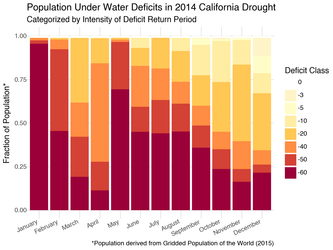
This figure really illustrates the human impact of the 2014 drought. Nearly 100% of the population was under a 60+ year deficit in January followed by 66% in May and approximately 40% for the remainder of the summer. That is a devastating drought!
In this lesson, you learned…
To navigate the SEDAC website to find and download datasets.
To access administrative boundaries from geoBoundaries data using API.
To temporarily subset a NetCDF raster stack using R packages such as dplyr and lubridate.
To crop a NetCDF raster stack with a spatial boundary.
To write a subsetted dataset to disk and create an image to share results.
To identify areas of severe drought and select these areas for further analysis.
To summarize data by county using the exactextractr tool.
To integrate WSIM-GLDAS deficit, GPW population, and geoBoundaries administrative boundary data to create complex time series visualizations.
References
Attributions
Image by freepik - 13
Image by freepik - 26
Our Klamath Basin Water Crisis article
A true color satellite image of California shows drought in the region which corresponds with decreases in freshwater reserves
